DadzBoyz
Well-Known Member
- First Name
- Dan
- Joined
- Jun 6, 2022
- Threads
- 53
- Messages
- 743
- Reaction score
- 807
- Location
- Oldsmar, FL
- Vehicles
- 22 Mustang Mach-E GTPE (ordered), 20 Mazda CX-5
- Occupation
- Software Systems Integrator
- Thread starter
- #1
First, I love my MME. It's been trouble free for 5,500 miles, it gets complimented constantly, it's a blast to drive....
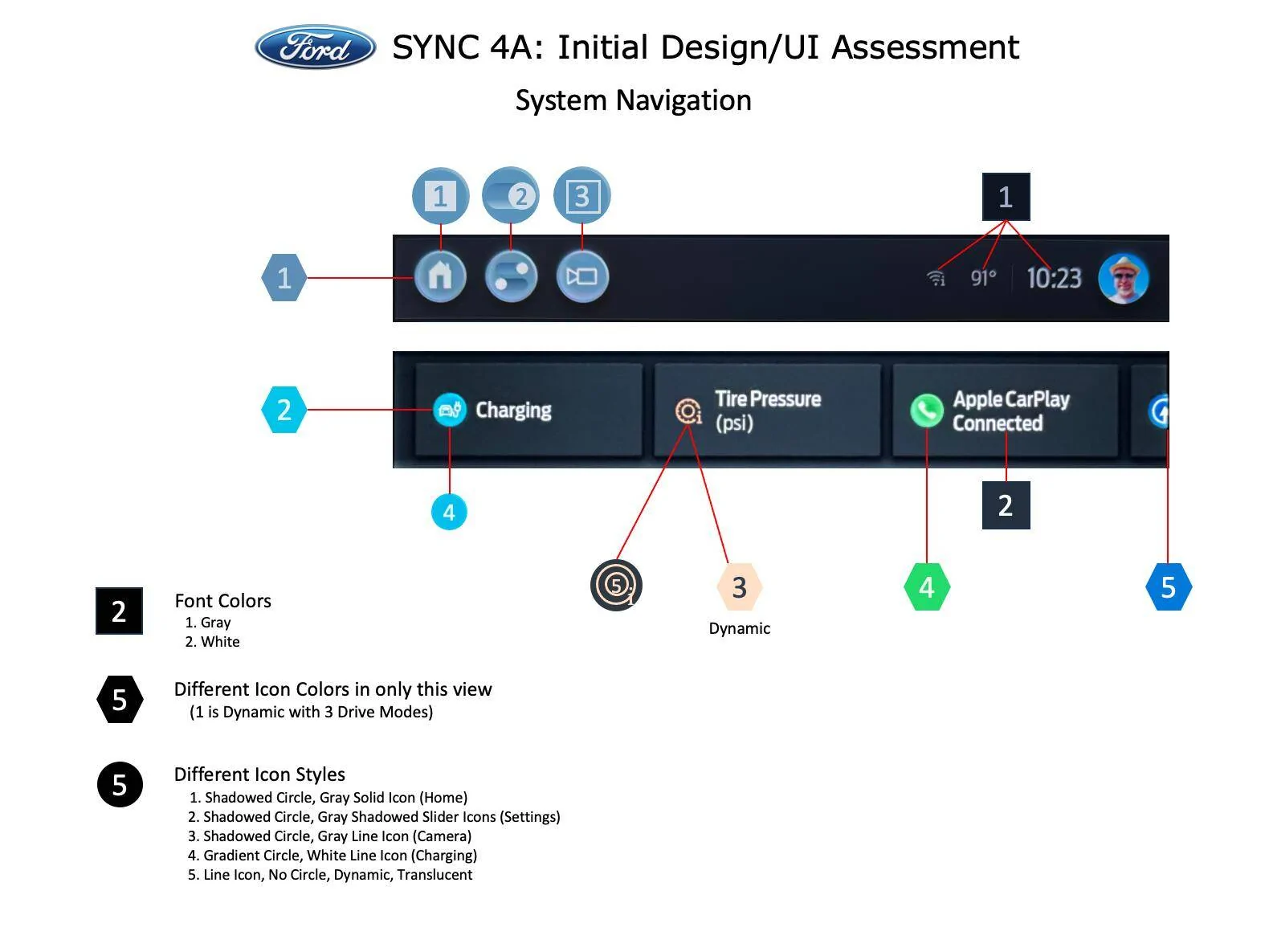
That said, the User Interface and User Experience are an inconsistent mish-mash of work done by different people (that don't appear to have talked to each other) at different times, without a roadmap, without a plan, without a design book, without a design philosophy, without design standards....
It's functional but inconsistent and ugly.
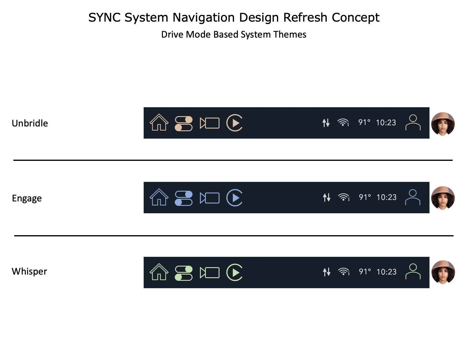
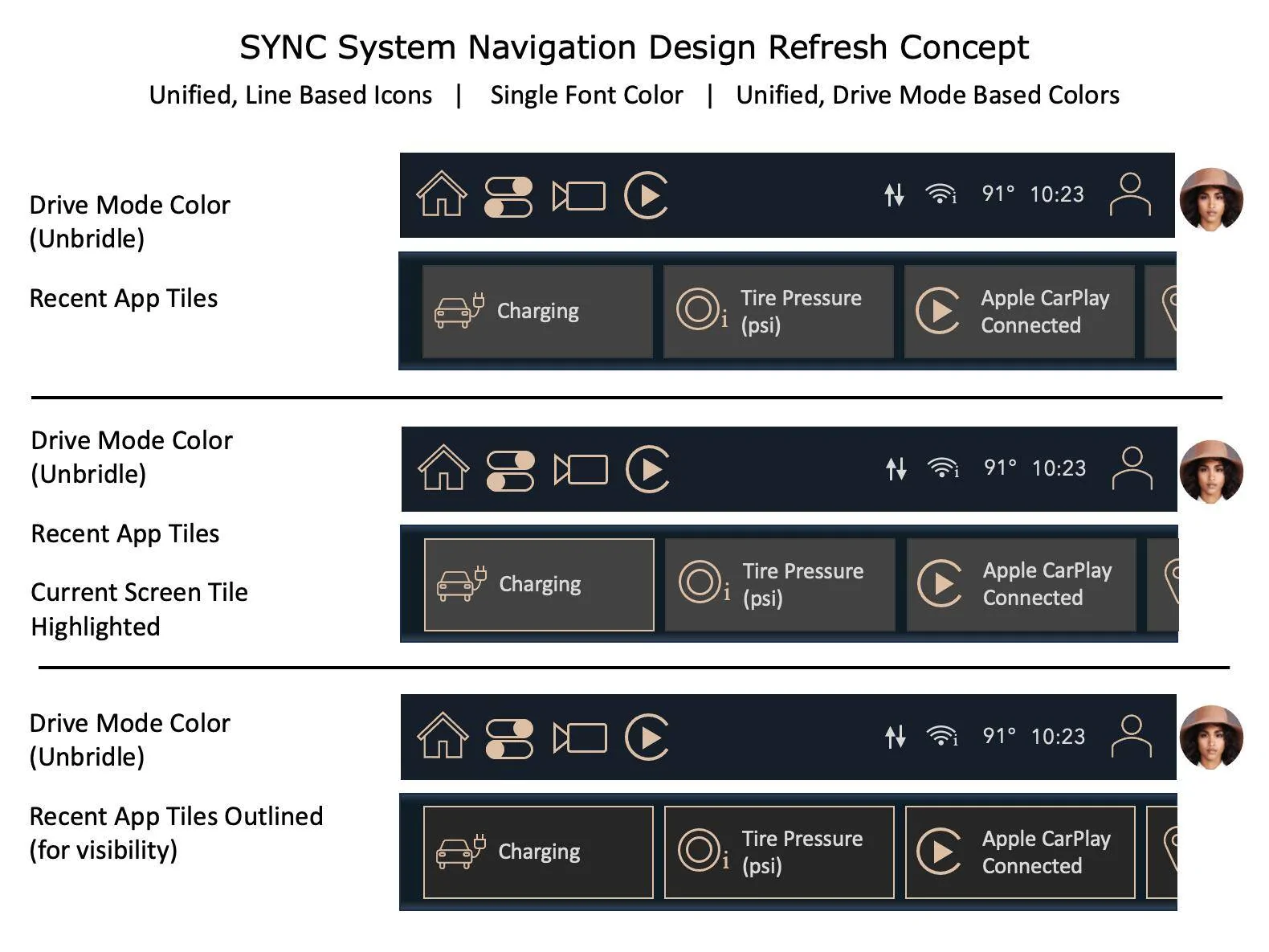
So, here we go again. Recently, I had a little time on my hands and felt a creative streak. This time I focused on the SYNC Infotainment screen. More specifically, I focused on the areas used to navigate the system. This work was only on the top panel/bar, and the tiles/shortcuts.
The end result is not a complete system redesign, but an effort to unify the User Interface, streamline graphic elements, and create more consistency in the overall approach within the existing framework. An approach that would enhance the experience without the heavy lift of a full redesign. Something doable in the shorter term.
My profession is in software development which includes functional, as well as visual design (UI/UX). I'm not a graphic artist, but I manage and work with them on projects constantly.
....and I still do not have Photoshop.
Please share your thoughts, critiques, ideas, etc.

That said, the User Interface and User Experience are an inconsistent mish-mash of work done by different people (that don't appear to have talked to each other) at different times, without a roadmap, without a plan, without a design book, without a design philosophy, without design standards....
It's functional but inconsistent and ugly.
In the last few weeks I threw out an idea for a FordPass redesign. It was thrown together pretty quickly, but it had a method, philosophy, and consistency.
Around the same time, @ihor shared an AMAZING new take on the instrument panel/cluster.
https://www.macheforum.com/site/threads/a-fresh-take-on-the-mustang-mache-instrument-cluster.29919/
So, here we go again. Recently, I had a little time on my hands and felt a creative streak. This time I focused on the SYNC Infotainment screen. More specifically, I focused on the areas used to navigate the system. This work was only on the top panel/bar, and the tiles/shortcuts.
The end result is not a complete system redesign, but an effort to unify the User Interface, streamline graphic elements, and create more consistency in the overall approach within the existing framework. An approach that would enhance the experience without the heavy lift of a full redesign. Something doable in the shorter term.
My profession is in software development which includes functional, as well as visual design (UI/UX). I'm not a graphic artist, but I manage and work with them on projects constantly.
....and I still do not have Photoshop.
Please share your thoughts, critiques, ideas, etc.
Sponsored