daemonic3
Well-Known Member
- First Name
- Terry
- Joined
- Jul 5, 2022
- Threads
- 14
- Messages
- 320
- Reaction score
- 292
- Location
- Sacramento, CA
- Vehicles
- '22 Premium ER Mach E, '21 F150 Powerboost
- Occupation
- Engineer
- Thread starter
- #1
Well team, I made an attempt at taking a cool plot to see efficiency vs speed on a flat (interstate 5 in NoCal) freeway. The goal was to try to determine mi/kWh efficiency and watch it plummet when going 80mph or so vs in the 50-60mph range.
Test setup:
Used CarScanner and OBD2 bluetooth device, data logging on
Premium ER RWD Mach E
Roughly 80F ambient
Unsure of wind, but traveled one direction (Southbound) entire test
Almost 20minutes of logging
Exclusively used adaptive cruise, smoothly bumping up to ~80mph and down to 50mph to get range of data
No hills except for occasional under/overpass
The plot data is a disappointment . While the speed data gives very valid data every single datapoint (probably the exact same data sent to the digital speedometer), the "instantaneous" energy consumption is very spikey/jumpy. This is probably because there is no such thing as "instantaneous" efficiency, you need some sort of time slice to calculate your delta position over delta joules. I believe these cars have the position and time part very accurate but Joules still has imperfections in the measurements, or some quantization that makes short duration measurements very inaccurate while very LONG duration measurements are solid (i.e. cumulative for the trip). The tool reports about 3 samples per second for these (fast loop) PIDs, so imagine trying to measure Joules that precisely in only 333ms! Not good...

First, the plot from CarScanner (above). The km/kWh plot is VERY jumpy, so much so that the autoscaling of the Y-axis makes it look like it is centered around 0, which is not true. The app won't let me scale the axes or bound them, nor do moving averages. So I had to export to something, and excel sounded easy.

This plot from Excel (above) is about the best I could do. While I had the full data I went ahead and converted to mi/kWh for more familiarity (at least in the US). To get rid of some jumpiness, I did a moving average of most recent 100 data points (about 30s), and it is STILL spikey. You can see a few places where traffic allowed me to settle at a "plateau" in the plot. There's a good one at 70mph early, and a couple 80mph plateaus later. But even in that nice 80mph plateau in the middle of the plot, the efficiency has some peaks and valleys. I think those were over/underpasses, so it made my data ugly.
Anyway, this data is tougher than I thought to collect. I may try again but it could be a while to get empty traffic conditions on a flat interstate stretch again. Also, I don't know if anyone else even cares! ?
Test setup:
Used CarScanner and OBD2 bluetooth device, data logging on
Premium ER RWD Mach E
Roughly 80F ambient
Unsure of wind, but traveled one direction (Southbound) entire test
Almost 20minutes of logging
Exclusively used adaptive cruise, smoothly bumping up to ~80mph and down to 50mph to get range of data
No hills except for occasional under/overpass
The plot data is a disappointment
. While the speed data gives very valid data every single datapoint (probably the exact same data sent to the digital speedometer), the "instantaneous" energy consumption is very spikey/jumpy. This is probably because there is no such thing as "instantaneous" efficiency, you need some sort of time slice to calculate your delta position over delta joules. I believe these cars have the position and time part very accurate but Joules still has imperfections in the measurements, or some quantization that makes short duration measurements very inaccurate while very LONG duration measurements are solid (i.e. cumulative for the trip). The tool reports about 3 samples per second for these (fast loop) PIDs, so imagine trying to measure Joules that precisely in only 333ms! Not good...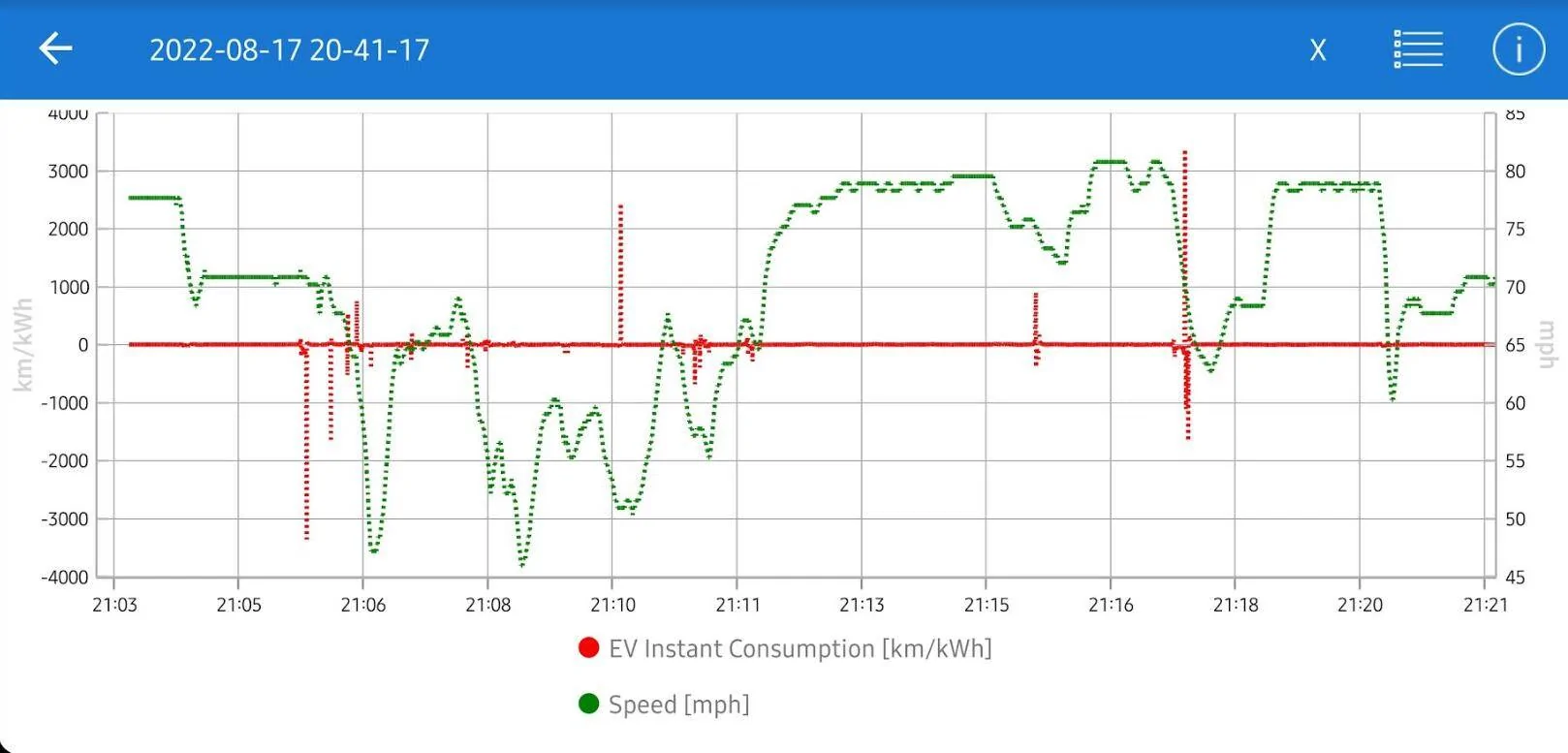
First, the plot from CarScanner (above). The km/kWh plot is VERY jumpy, so much so that the autoscaling of the Y-axis makes it look like it is centered around 0, which is not true. The app won't let me scale the axes or bound them, nor do moving averages. So I had to export to something, and excel sounded easy.
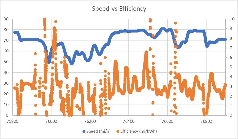
This plot from Excel (above) is about the best I could do. While I had the full data I went ahead and converted to mi/kWh for more familiarity (at least in the US). To get rid of some jumpiness, I did a moving average of most recent 100 data points (about 30s), and it is STILL spikey. You can see a few places where traffic allowed me to settle at a "plateau" in the plot. There's a good one at 70mph early, and a couple 80mph plateaus later. But even in that nice 80mph plateau in the middle of the plot, the efficiency has some peaks and valleys. I think those were over/underpasses, so it made my data ugly.
Anyway, this data is tougher than I thought to collect. I may try again but it could be a while to get empty traffic conditions on a flat interstate stretch again. Also, I don't know if anyone else even cares! ?
Sponsored