macchiaz-o
Well-Known Member
- First Name
- Jonathan
- Joined
- Nov 25, 2019
- Threads
- 171
- Messages
- 8,580
- Reaction score
- 15,988
- Vehicles
- MY21 J1 Premium RWD SR
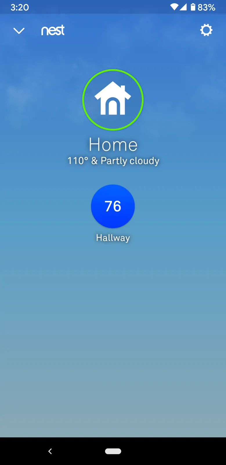
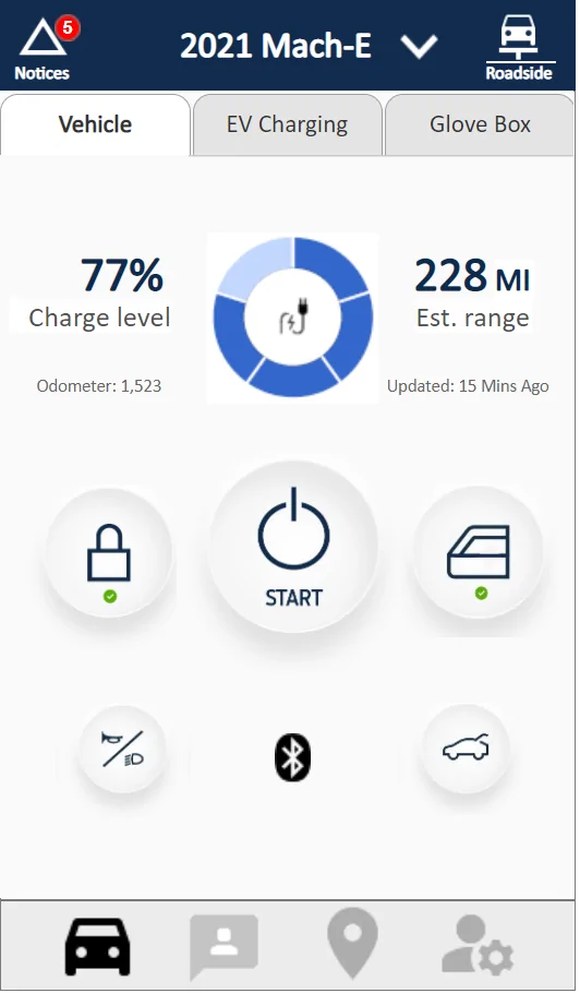
Looks nice! I'd push for a lot more changes, which I'll detail here, but these are all just my opinion versus yours so it's kinda ??Alright, so I worked on it some more today with assistance from @macchiaz-o . There is a new link for the app, feel free to click around. Here is the first screen you'll see when opening the app.

Please keep the feedback coming.
 at this point.
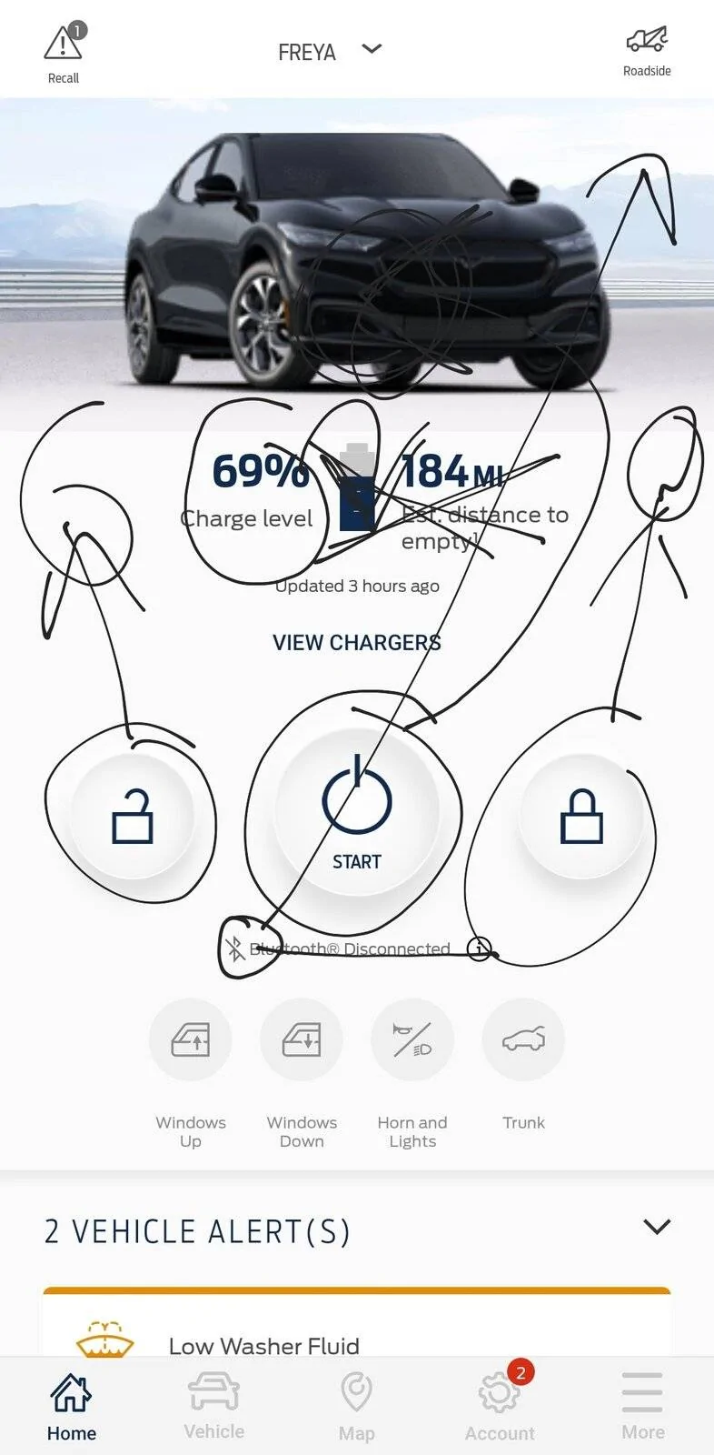
Personally, I'd still push for further simplification of this screen. More whitespace around the buttons, less details.
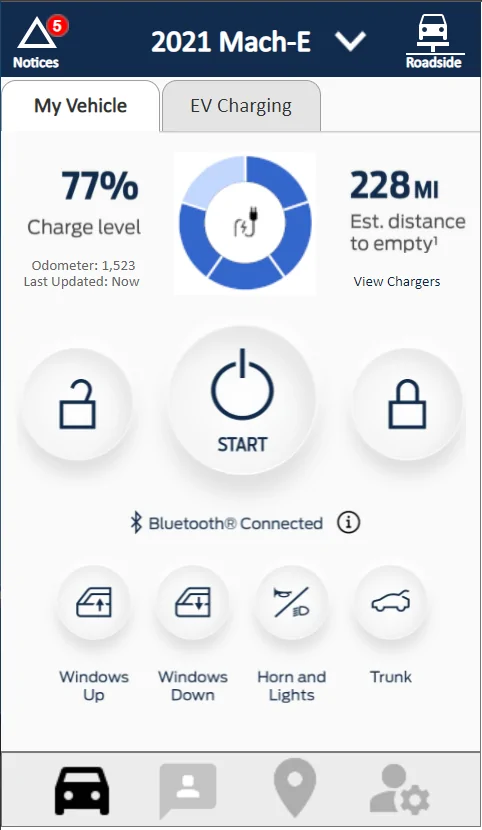
The "BT-Logo Bluetooth Connected (i)" could be replaced with just a digital key icon indicator (e.g. just the Bluetooth logo and a small key, with various colors/states to represent connectivity states).
If I want to see more details, I'm okay with digging a step deeper into the app. So I'd drop the labels under the row of buttons that includes windows up/down. I can tell their purpose from their icons.
I'd drop the 77%, the words Charge level, the odometer, and the last updated (especially when last updated is within the last few minutes).
I'd also drop the View Chargers option (it should be in the map tab already). I'd even remove the distance to empty... It's an extra detail that adds to my anxiety whereas the 5-segment battery chart is more than enough for my "first glance" of status plus DTE is a super rough estimation.
I'd also remove roadside assistance since it would already be in the Guidance/Assistance tab (the second tab). And I'd get rid of the top row of tabs. The icons along the bottom are the main tabs. Having the row of sub-tabs at the top makes it look crowded and confusing to me. I can get to charging info by touching the charging status indicator.
You and I discussed this privately, but I think you prefer more tabs and no scrolling, while I would prefer just the three or four main "tabs" shown at the bottom.
I want to see only the most important and most frequently accessed functions up top, and then I'd scroll to see lesser needed items. Those items can be categorized and put into titled sub-headers like Charging, Maintenance Records, and so on. Each of those areas can be kept brief and have options that jump into more detailed screens when appropriate.
Sponsored
")