FordPass App- New App Screenshots

  • Thread starter Deleted member 3663
  • Start date
  • Watchers 1

Shayne

Well-Known Member
Joined
Aug 9, 2020
Threads
18
Messages
3,824
Reaction score
2,738
Location
Northern Ontario Canada
Vehicles
2021 MME4x Prem
Occupation
Retired
Country flag
Alright, so I worked on it some more today with assistance from @macchiaz-o . There is a new link for the app, feel free to click around. Here is the first screen you'll see when opening the app.

2021-07-09.webp


Please keep the feedback coming.
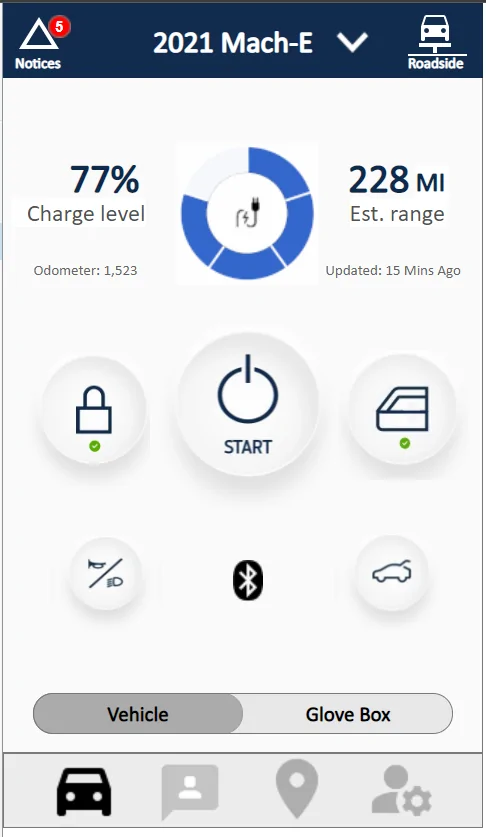
I'd go for less white and a dark theme like the car. Wonder what that would look like? Getting rid of the car jpg from loading is a good idea. Your charging indicator (as per car) looks good. For me there is no need for animating it however keep it thin and simple. Has a simple task and anything that is not required and takes resources need not be there. Good thread and nice job.
Sponsored

 
OP
OP

Deleted member 3663

Guest
I'd go for less white and a dark theme like the car. .
You and me both. Every app I have that supports dark theme, I use. I love dark theme. I didn't do this one, because I am mainly trying to address appearance (vs what is current) along with better functionality. If I had the time, I get into a dark theme, but that would be a lot of work..
 
OP
OP

Deleted member 3663

Guest
TABS....

@macchiaz-o , @Mirak, and others....

So I've been looking at other apps and how they address tabs. I still haven't found anything I like. But here are three and just wanted to know what you think if worth pursuing or not.

Walmart... see screen shot below. I could remove the tabs from all pages in my Ford App, and keep the vehicle controls (start, lock, etc) all by themself. Then I'd use one of the bottom menu buttons to display items like this in the Walmart app.

Ford Mustang Mach-E FordPass App- New App Screenshots Screenshot_20210711-210029


SmartThings... see screen shot below. I personally don't like this one, but it's an idea. Instead of tabs, I use a drop down for the three tabs like in the SmartThings app. I don't like that part, but the part I do like (and you can't see in the screenshot) is you can flip to go right to next page (like making a choice from the drop down), flip again, etc and flip to go back.

Ford Mustang Mach-E FordPass App- New App Screenshots Screenshot_20210711-210839_SmartThings


One more, I actually like this.. from OneDrive app... Instead of tabs they have two simple buttons on top (All, Albums) that you can touch, or like the smartthings app, you can swipe to go right, and swipe to go back..

Ford Mustang Mach-E FordPass App- New App Screenshots Screenshot_20210711-212309_OneDriv


Just some ideas...
 
Last edited by a moderator:

macchiaz-o

Well-Known Member
First Name
Jonathan
Joined
Nov 25, 2019
Threads
171
Messages
8,579
Reaction score
15,987
Location
}not/A/gr8'Place.2.store-mEyePassword{
Vehicles
MY21 J1 Premium RWD SR
Country flag
TABS....

@macchiaz-o , @Mirak, and others....

So I've been looking at other apps and how they address tabs. I still haven't found anything I like. But here are three and just wanted to know what you think if worth pursuing or not.

Walmart... see screen shot below. I could remove the tabs from all pages in my Ford App, and keep the vehicle controls (start, lock, etc) all by themself. Then I'd use one of the bottom menu buttons to display items like this in the Walmart app.

Screenshot_20210711-210029.jpg


SmartThings... see screen shot below. I personally don't like this one, but it's an idea. Instead of tabs, I use a drop down for the three tabs like in the SmartThings app. I don't like that part, but the part I do like (and you can't see in the screenshot) is you can flip to go right to next page (like making a choice from the drop down), flip again, etc and flip to go back.

Screenshot_20210711-210839_SmartThings.jpg


One more, I actually like this.. from OneDrive app... Instead of tabs they have two simple buttons on top (All, Albums) that you can touch, or like the smartthings app, you can swipe to go right, and swipe to go back..

Screenshot_20210711-212309_OneDrive.jpg


Just some ideas...
Those are all good. My opinion is, focus first on content and organization, and stuff like tabs, folders, pages, etc comes later.

Current FordPass content is a mess. Some info is repeated in two or more places, some feels like they just gave up (mainly the hamburger menu content and some of settings).

Also Ford has its own designers. They'll design and won't want our design input. The feedback they really need is: what do we do most? what functions are most important? what functions are too confusing? what is missing?
 
OP
OP

Deleted member 3663

Guest
Yeah, their app is beyond a mess. In my app, I've almost eliminated duplication, and almost everything is organized. Still have some work to do. (for example, I was just looking at all the sections they have for "charging" and they really only have 1 section, subdivided into 3 parts, but you wouldn't know that from the Ford app, it's a maze that is hard to navigate)

I literally don't use the app unless I have to (which is rare) because it has become non-functional between the myriad pop-ups that come and go, with some never going away taking up valuable real-estate, scrolling that freezes, information extremely difficult to find, and when I try to touch a control like unlock, it moves right before I try to use it and I end up touching something else that takes me some place I didn't want to be. The app right now is garbage.

Hence.. why I am doing this. They can listen or not. All I want out of this is the landing page we've been focused on that doesn't move and jiggle, but rather a sturdy, non-moving, non-frozen, remote control in my hand that I can actually use.
 
Last edited by a moderator:


OP
OP

Deleted member 3663

Guest
Butta Bing, butta boom. @macchiaz-o , @Mirak, and others.... Tell me if this works (as far as removing tabs, but still having some functionality like tabs). I think this is a good compromise??? Maybe? :)

Users can slide right and left... or just tap on vehicle/ Glove Box buttons

APP LINK for interactive demo

Ford Mustang Mach-E FordPass App- New App Screenshots 2021-07-12 (3)


Ford Mustang Mach-E FordPass App- New App Screenshots 2021-07-12 (2)
 

Mirak

Banned
Banned
Joined
Oct 8, 2020
Threads
111
Messages
3,754
Reaction score
6,166
Location
Kansas
Vehicles
"Sonic" 2021 MME Grabber Blue First Edition
Country flag
I like the design overall, but I would not bury charge management inside the glove box. Charge management is one of the single most important uses of the app. I’d make a lightning icon at the bottom. Or, somehow make it intuitive that you can tap the charging ring on the home page to access all the charging related stuff. Just definitely not in the glove box.
 
OP
OP

Deleted member 3663

Guest
Charge management is one of the single most important uses of the app. I’d make a lightning icon at the bottom. Or, somehow make it intuitive that you can tap the charging ring on the home page to access all the charging related stuff. Just definitely not in the glove box.
Is there any part of charge management that is the most important, or are you just wanting a quick action to get to all the charge management sections (which aren't many, just times/locations, departure times, and ford network)?
 

macchiaz-o

Well-Known Member
First Name
Jonathan
Joined
Nov 25, 2019
Threads
171
Messages
8,579
Reaction score
15,987
Location
}not/A/gr8'Place.2.store-mEyePassword{
Vehicles
MY21 J1 Premium RWD SR
Country flag
I like the way you have charge management divided out right now. Important detail is on main screen, the current session details and quick actions are on screen reached by tapping the charge ring, and miscellaneous/infrequent settings are in the glove box.

The only changes I'd make are to move the odometer into the glove box (inside vehicle details), and keep the window and door lock icons as they are initially. Don't change those icons since you added green and red lights... If you DO want to change the icons that is fine, but they are currently backwards. The open padlock should be shown while the doors are locked, since by convention, the icon should represent the requested action/verb and not its current state.

I'd also remove the current charge level percentage or at least move it into the charge details screen.
 
OP
OP

Deleted member 3663

Guest
Alright, so I am a wrap for now. Most of the buttons have second level screens to view, but not much past that. Meaning this is a very interactive wireframe at this point, but it won't dive down into 3rd+ level screens. Thanks for all the input.

Link to wireframe.
 
Last edited by a moderator:
OP
OP

Deleted member 3663

Guest
What the live Ford app looks like when you open it today: You have to scroll down to get to buttons. Pop-ups often riddle this screen.
Ford Mustang Mach-E FordPass App- New App Screenshots Screenshot_20210713-233013_FordPass


My proposed app 1st screen. No scrolling. All controls easy to see, easy to use. And you have real information at a glance about your vehicle.
Ford Mustang Mach-E FordPass App- New App Screenshots Screenshot_20210713-232028
:

What the live Ford app looks like in vehicle screen, can't find anything easily. Have to scroll down, scroll right, and run into sections that freeze briefly.
Ford Mustang Mach-E FordPass App- New App Screenshots Screenshot_20210713-233031_FordPass


My proposed screen. Just slide from vehicle to Glove Box. No scrolling up or down or sideways. All the buried, hard to find items Ford has in the live app vehicle screen can be found right here in this screen with a simple touch, easily.
Ford Mustang Mach-E FordPass App- New App Screenshots Screenshot_20210713-232110


Play around with my interactive demo. If Ford can build a world class EV, they can build a world class app to compliment it. Tell Ford you want the FordPass app improved.
 

Mirak

Banned
Banned
Joined
Oct 8, 2020
Threads
111
Messages
3,754
Reaction score
6,166
Location
Kansas
Vehicles
"Sonic" 2021 MME Grabber Blue First Edition
Country flag
It’s really great. Now that I’ve played with the demo I can see how intuitive it is, such as the banner which tells you what has happened when you press the lock/unlock icon.

I still think I’d move the charge management out of the “glove box.” It just doesn’t seem like a glove box kind of item. Being able to make adjustments to the charging schedule and max charge are two of the most important aspects of the app. I wonder if there is a way to incorporate those functions into either the bottom bar, or into the home page.

Great job.
 

Sagacity

Well-Known Member
First Name
Matthew
Joined
Mar 12, 2021
Threads
4
Messages
51
Reaction score
159
Location
Utah
Vehicles
Mach E GT/PE, 2015 Limited Edition Mustang GT 0146
Occupation
Network Administrator
Country flag
I really like the layout and design. very intuitive. Would be nice if ford would put more effort into their app.
 
OP
OP

Deleted member 3663

Guest
I still think I’d move the charge management out of the “glove box.” It just doesn’t seem like a glove box kind of item. Being able to make adjustments to the charging schedule and max charge are two of the most important aspects of the app. I wonder if there is a way to incorporate those functions into either the bottom bar, or into the home page.
I don't disagree. I'd also like to see a "condition' now function as I don't use a schedule. but often know I'm going somewhere at least 30 mins in advance. My goal was just to present an alternative to what Ford has. Hopefully, this will give them ideas. I'm just sorta done playing with it and changing/adding, etc. The people that get paid, it's their job to make a better app. :)

My question, is how do we get support from people on this forum to turn Ford's head?
 

macchiaz-o

Well-Known Member
First Name
Jonathan
Joined
Nov 25, 2019
Threads
171
Messages
8,579
Reaction score
15,987
Location
}not/A/gr8'Place.2.store-mEyePassword{
Vehicles
MY21 J1 Premium RWD SR
Country flag


Top