Mach_Enrique
Well-Known Member
- First Name
- Chris
- Joined
- Feb 4, 2020
- Threads
- 7
- Messages
- 94
- Reaction score
- 348
- Location
- Denver
- Vehicles
- RIP -2021 MachE GT; 2023 Lighting; WRX STI; BMW i5
- Occupation
- Finance
- Thread starter
- #1
Hi Forum Folks! This week 4.1.2 updated on my 2021 GT (which I think makes it job 2?) and I am not EA. Most unexpected but thought I would drop some impressions. I looked for a thread to post thoughts and impressions but I did not find any other than a few threads on specific topics, so I thought I’d start one.
First I would have to say I’m still very sorry and sympathetic for any MachE owners out there who cannot get it software updates, frunk buttons, etc.
Impressions So Far:
First I would have to say I’m still very sorry and sympathetic for any MachE owners out there who cannot get it software updates, frunk buttons, etc.
Impressions So Far:
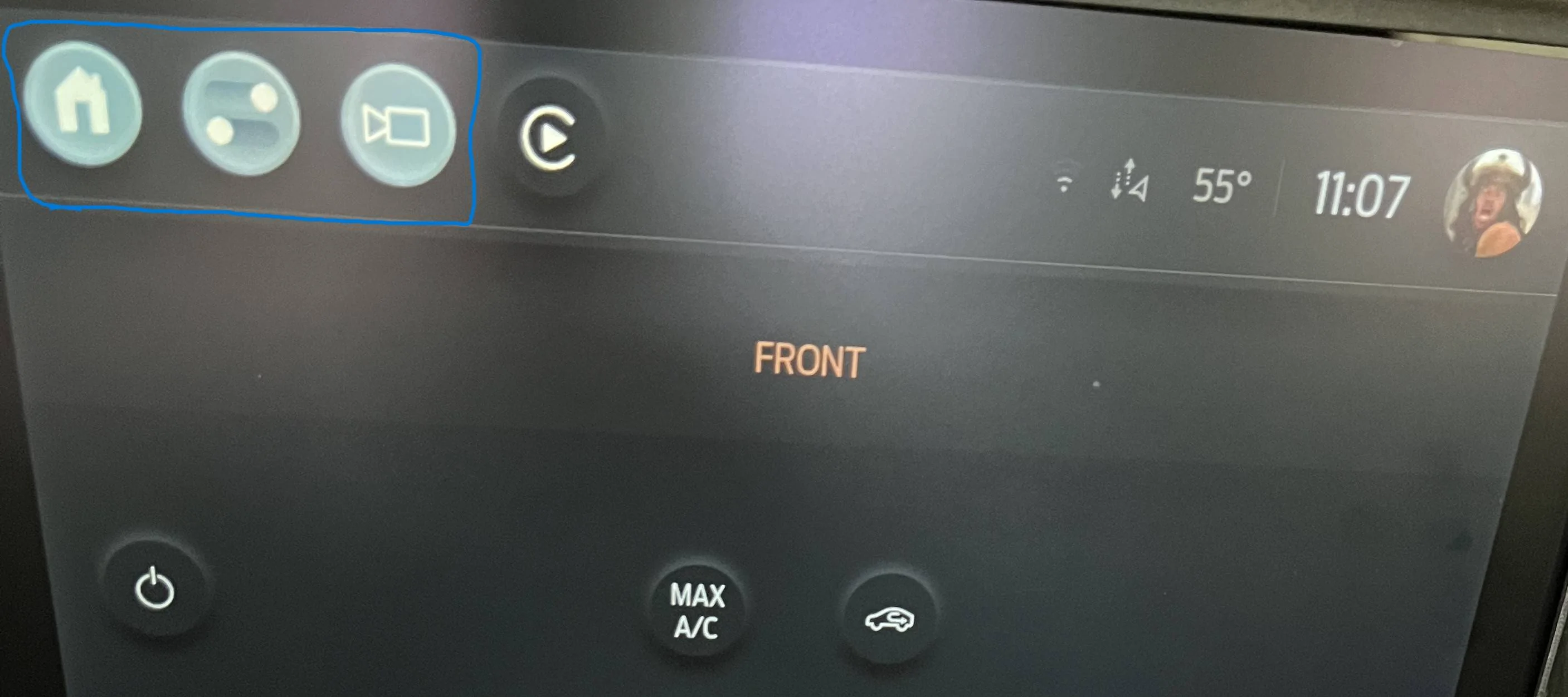
- Good use of top of screen space especially now with one touch camera button. Used this already many times in last few days.
- I miss the car icon for the settings and drive mode. The standard software icon with ”slider buttons in a circle” is not quite intuitive for drive modes like the car that pulled forward. Also it is smaller and a bit hard to touch on first try when car is moving without anchoring your hand to the screen to neutralize bouncing.
- New drive mode screen is cooler and easier to use. It’s good looking and intuitive to find what you need.
- I think we lost ability to shrink/grow main screen above the “cards” at the bottom. Seems like we are in perma big screen on mode now. I did use smaller screen with bigger cards sometimes but the bigger main area full time seems even bigger so net plus (edit: after a week really like the bigger app area and smaller cards at bottom).
- Noticed overall that buttons and touch points are smaller. This is a pain as the MachE is a bit bumpy and bigger icons and touch points on the screen help you not “miss” the touch due to bumps on the first try. I went through a lot of screens today and there is way too much space wasted with small icons (i.e. home screen)...use the space to make bigger icons for easier "touch it right on the first try" odds.
- They moved the car play icon to the top screen and not a card on the bottom…easy to miss but like it there
- They moved the charging screen button and a few items to the “home” screen (home icon on top)…took a minute to find. A few other things are now on the Home Screen too.
- The new use of the knob is brilliant. I always liked the knob before. Now you can adjust many things with the knob like heat and fan levels. Takes less time of eyes off road while adjusting and removes the challenge of slider moves when car is on a rougher and bouncy road. This may be my favorite change.
Sponsored
Last edited: