ihor
Member
- First Name
- Ihor
- Joined
- Jan 21, 2023
- Threads
- 1
- Messages
- 11
- Reaction score
- 128
- Location
- Canada, BC
- Vehicles
- 2022 Mach E GTPE
- Thread starter
- #1
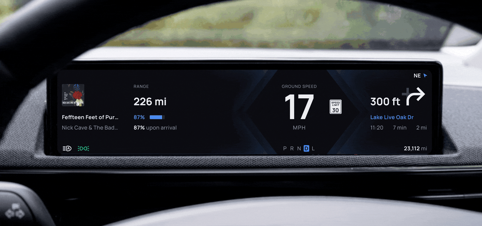
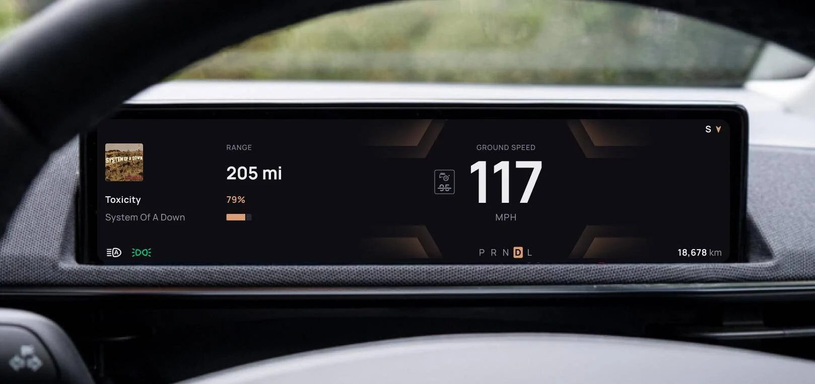
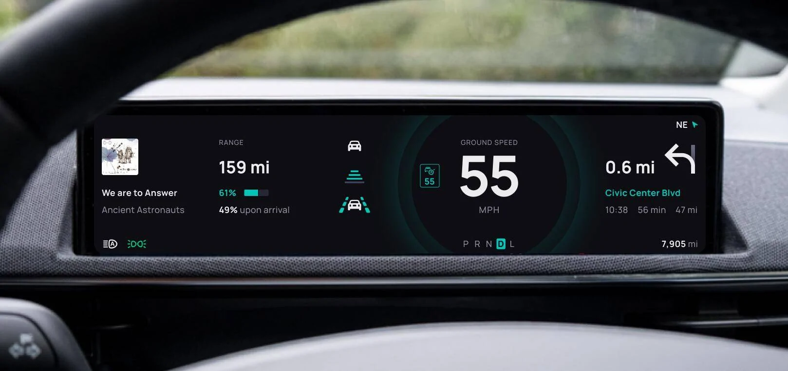
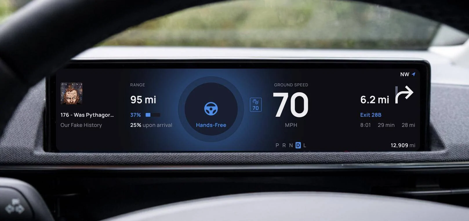
Although I absolutely adore every inch of my MachE GTPE, I can't help but be irked by the existing instrument cluster design. As a product designer, I couldn't resist taking a crack at redesigning the panel that is always in my sight but…, well, could use some improvement.


What I think is wrong with the current design?
P.S. This is my first post here, so please bear with me if this kind of post isn’t welcomed here.
Drive safe!
What I think is wrong with the current design?
- Information architecture and hierarchy: The most crucial information should be more prominent, but instead, I find a large toy car in square brackets pushing the blue box. Is the fact that the distance to the car ahead is okay really the most important info?
- Inconsistency across driving modes: Switching to Unbridled mode reshuffles everything on the screen. It lacks continuity.
- Empty space issue: I like a clean design, but the panel seems empty most of the time. There must be a way to organize vital information so it's accessible without distracting the driver.
- Random sizes and alignment: Everything appears misaligned, and the randomness in sizes lacks cohesion.
- Aesthetics: This is very subjective, but to me, the design feels outdated like someone unearthed a vintage CD titled "3D Icons set for Photoshop 3.0" from their dad's attic.
- Easy implementation: I aimed for something easily implemented without heavy engineering work. For example, allowing the driver to customize the leftmost area (e.g., someone would prefer seeing display battery consumption analysis instead of the player widget) seemed sensible.
- Consistency in element placement: Not all widgets are always visible, so it can be tempting to move them around to fill empty spaces. However, I kept the elements in their original places to make them easier to find.
P.S. This is my first post here, so please bear with me if this kind of post isn’t welcomed here.
Drive safe!
Sponsored