Fins160
Well-Known Member
- First Name
- JP
- Joined
- Apr 7, 2022
- Threads
- 11
- Messages
- 235
- Reaction score
- 270
- Location
- Tempe, AZ
- Vehicles
- 2022 MachE Select C/T Dark Matter Gray
- Occupation
- Engineer
- Thread starter
- #1
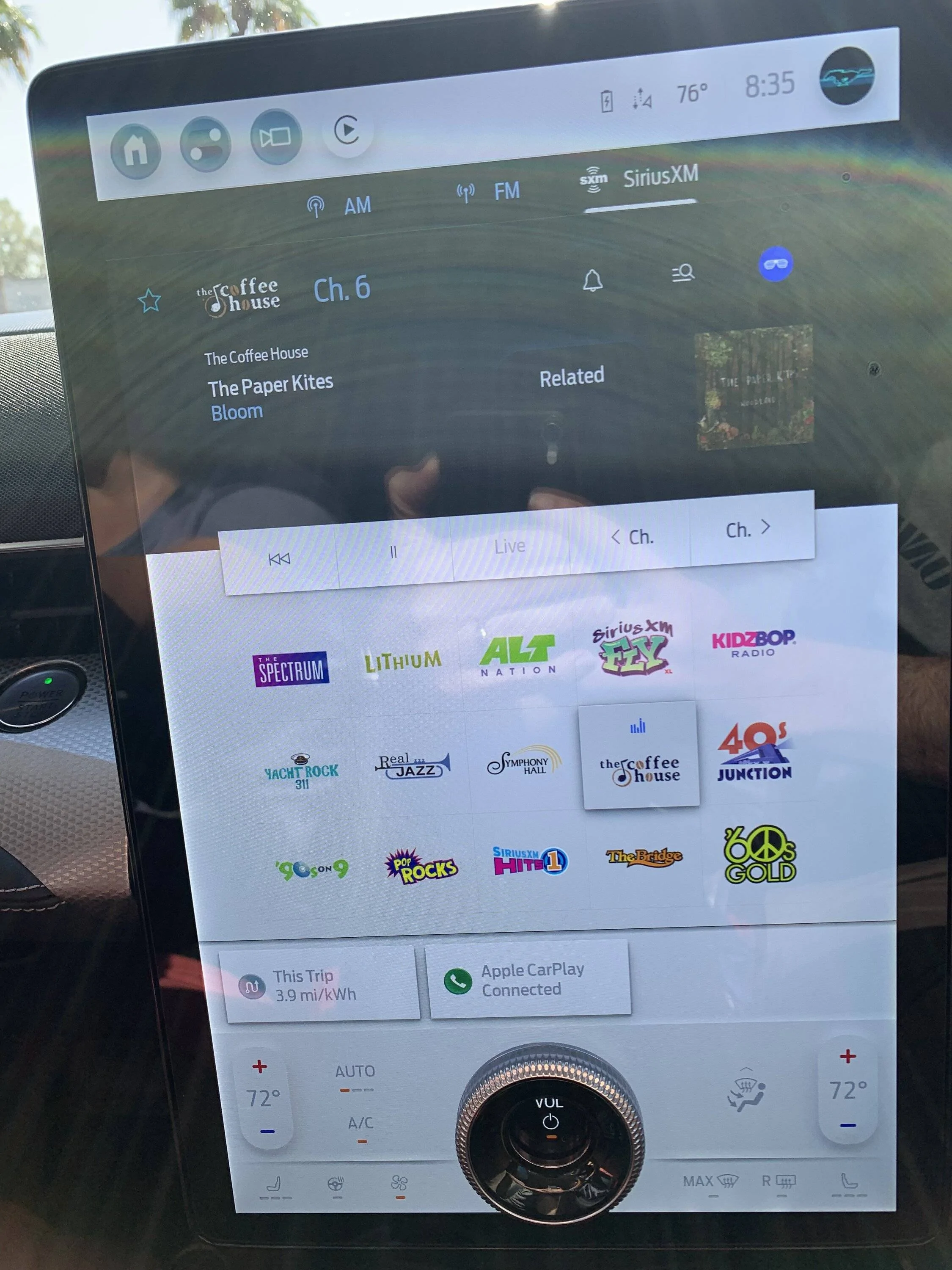
Drove as a passenger today. My wife uses the white background on the main screen, while I use the black, so maybe I am just not used to seeing the screen. I was flabbergasted at the absolute mess of a UI with the white background.
There is someone (I assume) at Ford whose job it is to give the OK for a software release. Someone took a look at this mess, and was like "yup, ship it!".
How in the world is this possible?
Is this new with 4.2.5, or has it always looked this bad since the 4.2 updates? Yikes...

There is someone (I assume) at Ford whose job it is to give the OK for a software release. Someone took a look at this mess, and was like "yup, ship it!".
How in the world is this possible?
- The light grey text on the white background makes the text hardly readable. My wife said she thought everything was "disabled", since typically in software a greyed-out icon is not available.
- The three buttons on the top with the grey background, and the CarPlay icon with white. Why don't they match?
- The black Sirius background with white everywhere else - why wouldn't this match?
Is this new with 4.2.5, or has it always looked this bad since the 4.2 updates? Yikes...
Sponsored
")