I’m just going to say it. The 4.1.2 interface is ugly!
- Thread starter opbarnes
- Start date
- Watchers 3
-
- Tags
- 4.1.2 user interface
ihor
Member
- First Name
- Ihor
- Joined
- Jan 21, 2023
- Threads
- 1
- Messages
- 11
- Reaction score
- 128
- Location
- Canada, BC
- Vehicles
- 2022 Mach E GTPE
I feel your pain. I hope they fix it soon
Kamuelaflyer
Well-Known Member
- First Name
- Bill
- Joined
- Feb 18, 2020
- Threads
- 11
- Messages
- 11,359
- Reaction score
- 22,944
- Location
- Hawaii
- Vehicles
- 2021 Premium Infinite Blue. ER AWD. 2020 Raptor, 2021 Ranger.
Windows 95? Don’t be absurd. Windows 2.1Where is the inspiration from? Windows 95?! The skeuomorphic design of the buttons isn’t bringing back retro vibes for me. It’s just ugly.
HuntingPudel
Well-Known Member
- First Name
- Steve
- Joined
- Mar 23, 2021
- Threads
- 88
- Messages
- 12,942
- Reaction score
- 17,391
- Location
- Bay Area, CA
- Vehicles
- 2024 MME GT with Performance Upgrade, 1979 Fire-Am, 1972 K/5 Blazer
- Occupation
- Engineering
I think I said this in another thread before I even got it. LOL ??
ChargedCheese
Well-Known Member
- Joined
- Sep 11, 2021
- Threads
- 2
- Messages
- 135
- Reaction score
- 239
- Location
- Centennial, CO
- Vehicles
- 2021 MME 4XE, 2017 BMW i3 94wh
- Occupation
- Engineer
The new buttons absolutely blow my mind. Was there not a single person on the testing team or the UI team that said, "Hey, maybe these three buttons up here don't look that great." or "Hey, maybe we shouldn't move the volume control indicator down to a spot where you can't keep your eyes on the road."Where is the inspiration from? Windows 95?! The skeuomorphic design of the buttons isn’t bringing back retro vibes for me. It’s just ugly.
HGxxx
Well-Known Member
- First Name
- Harish
- Joined
- Nov 16, 2022
- Threads
- 0
- Messages
- 280
- Reaction score
- 328
- Location
- New york
- Vehicles
- Fusion energi, mach e premium standard range
Just make that grey background color on the buttons black/white ( depending on the mode) and use standard setting symbol instead of whatever that symbol is ( the one between home and camera). It will instantly make it better. It's a low hanging fruit
Jim D
Well-Known Member
- First Name
- Jim
- Joined
- May 6, 2021
- Threads
- 3
- Messages
- 256
- Reaction score
- 223
- Location
- Mahopac NY
- Vehicles
- Mustang Mach E - GT
- Occupation
- Software Engineer
I happen to think the screen is far more responsive, and I have a lot less double taps to get things done.
Jimrpa
Well-Known Member
- First Name
- Jim
- Joined
- Sep 10, 2020
- Threads
- 297
- Messages
- 9,547
- Reaction score
- 12,874
- Location
- Wayne, PA
- Vehicles
- 2021 Infinite Blue Premium Mustang Mach E ER AWD
- Occupation
- Retied (formerly tried to herd highly technical, independent cats)
If you think the 4.1.2 Sync 4 UI is ugly, you should see the latest UI for the market leading purveyor of Electronic Medical Records (trust me, your health system uses this piece of garbage). I won’t name the company because they’re privately owned and very adverse to negative comments, but the UI literally looks like cutting edge early 1990s Netscape Navigator. Trust me, there are many worse UIs in critical applications than the latest Sync 4 UI.Where is the inspiration from? Windows 95?! The skeuomorphic design of the buttons isn’t bringing back retro vibes for me. It’s just ugly.
Jimrpa
Well-Known Member
- First Name
- Jim
- Joined
- Sep 10, 2020
- Threads
- 297
- Messages
- 9,547
- Reaction score
- 12,874
- Location
- Wayne, PA
- Vehicles
- 2021 Infinite Blue Premium Mustang Mach E ER AWD
- Occupation
- Retied (formerly tried to herd highly technical, independent cats)
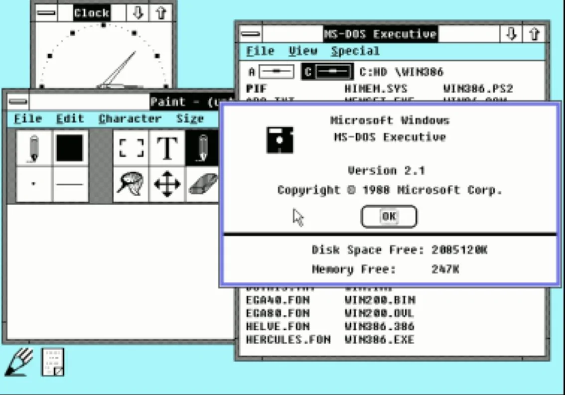
For those who were wondering how bad Windows 2.1 was:Windows 95? Don’t be absurd. Windows 2.1
RedOctobrrr
Well-Known Member
- Joined
- Nov 29, 2022
- Threads
- 2
- Messages
- 206
- Reaction score
- 209
- Location
- Chicago
- Vehicles
- '23 Mach E Select AWD
TWO GIGS OF DISK SPACE IN 1988 ??????For those who were wondering how bad Windows 2.1 was:
bp99
Well-Known Member
- Joined
- Jul 28, 2021
- Threads
- 1
- Messages
- 290
- Reaction score
- 453
- Location
- Oregon
- Vehicles
- 22 MME eAWD, 21 MME CA Route 1 (sold)
It's interesting that just a few months after they moved the volume from the bottom to the top, that they decided to move it back to the bottom again. I really don't care about that as it's more about what I hear than what a number says, but still a sign about indecisiveness.or "Hey, maybe we shouldn't move the volume control indicator down to a spot where you can't keep your eyes on the road."
dmitry
Well-Known Member
- First Name
- dmitry
- Joined
- Jan 21, 2022
- Threads
- 20
- Messages
- 470
- Reaction score
- 596
- Location
- California
- Vehicles
- 2022 Mustang Mach-E GT
I glad I turned off automatic update. So far the latest version on my car is the best one. I better convert “P” button to activate camera then have this ugly icons.
astronut325
Well-Known Member
- Joined
- Nov 22, 2021
- Threads
- 10
- Messages
- 316
- Reaction score
- 343
- Location
- Los Angeles, CA
- Vehicles
- Mach-E Premium, Toyota Camry, Honda Odyssey
- Occupation
- Software analyst
I like it. ?
DevSecOps
Well-Known Member
- First Name
- Todd
- Joined
- Sep 22, 2021
- Threads
- 69
- Messages
- 4,764
- Reaction score
- 11,624
- Location
- Sacramento, CA
- Vehicles
- '21 Audi SQ5 / '23 Rivian R1T / '23 M3P
- Occupation
- CISO
When I saw the design I actually sent an email to some people at Ford... This is what I said (in part because there were other things discussed as well):
Team,
... some of the basic UI blunders in the recent 4.1.2 release.
In the below image you’ll notice the following:

In the below imagine you’ll notice that the volume label is on the power button. In UI design you NEVER put 2 different call to actions on a singular button. This is a power button, it is not a volume button. While I understand that “volume” is likely referencing the wheel, this is not the place to put it, since this is actually on top of a button that serves another purpose. Put the volume label to the upper right above the wheel where there’s no button.

Sincerely,
Todd"
I received a response from the Sr. Product Manager:
"...Thank you very much for sending us very detailed feedback on some of the UI changes that were implemented recently. The Team has sent your feedback to the appropriate parties here at Ford and they are investigating."
Team,
... some of the basic UI blunders in the recent 4.1.2 release.
In the below image you’ll notice the following:
- The 3 leftmost icons on the top bar are not the same color as the 2 rightmost icons. They should all be the same color. They should be colored in accordance with the drive mode and light/dark settings, just like the other icons within the UI. They should not be white when using dark mode.
- The home and settings icons are solid fill icons, meaning the icon is colored throughout. The camera icon, and by nature the Ford logo, are outline icons. There should be consistency here.
- The home icon takes you to an app tray, there’s nothing “home” about this location. The home icon is supposed to be used to return “home” where you would normally keep the screen for viewing. This should be an app tray icon.
- Using a switch icon (double toggle) for settings is a strange choice as well. Maybe a cogwheel would be better, just like all modern devices use.
- Putting the profile button on the furthest right corner is not what anyone expects. The clock should be moved back to the far right corner, just like Android, iPhones, Tablets, TVs, Windows, MacOS and every other device with a UI
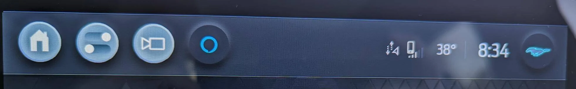
In the below imagine you’ll notice that the volume label is on the power button. In UI design you NEVER put 2 different call to actions on a singular button. This is a power button, it is not a volume button. While I understand that “volume” is likely referencing the wheel, this is not the place to put it, since this is actually on top of a button that serves another purpose. Put the volume label to the upper right above the wheel where there’s no button.

Sincerely,
Todd"
I received a response from the Sr. Product Manager:
"...Thank you very much for sending us very detailed feedback on some of the UI changes that were implemented recently. The Team has sent your feedback to the appropriate parties here at Ford and they are investigating."
Last edited:
Similar threads
- Replies
- 15
- Views
- 3,990