I’m just going to say it. The 4.1.2 interface is ugly!

Maquis

Well-Known Member
First Name
Dave
Joined
Dec 21, 2020
Threads
34
Messages
5,698
Reaction score
8,087
Location
Illinois
Vehicles
2021 Mach E4X, 2023 Lightning Lariat ER
Country flag
I’ve never wanted a camera button. ? I’m not sure what’s wrong with everyone else’s cars, but my cameras come on automagically, whenever they’re needed. About the only time I need to fire them up manually is to show someone why it’s impossible to develop a practical Tesla-style monitoring system with the current cameras and configuration (amazing how many people forget that our mirrors retract when parked ?)
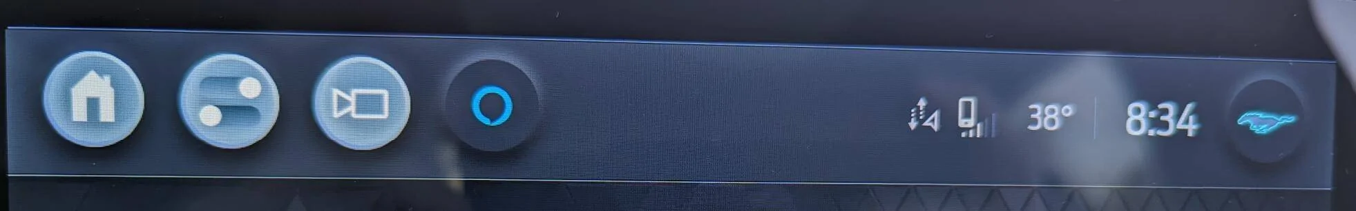
I didn’t, either. But I admit I have used it a couple times now that it’s there.
Sponsored


ARK

Well-Known Member
Joined
Aug 21, 2020
Threads
45
Messages
2,938
Reaction score
4,297
Location
Los Angeles
Vehicles
'21 Premium SR AWD
Country flag
I think the new UI is an improvement over the prior UI, even if there is still room for improvement.

My biggest gripe is the disappearance of the cards, which I liked. Or at the very least, I typically default to having the radio app open, and I don’t need to see all three rows of my presets. I liked the cards because I got to see some more info from the other apps while on the radio.

The camera button is great though, love not having to shift to R to pull the cameras up.
 

Maquis

Well-Known Member
First Name
Dave
Joined
Dec 21, 2020
Threads
34
Messages
5,698
Reaction score
8,087
Location
Illinois
Vehicles
2021 Mach E4X, 2023 Lightning Lariat ER
Country flag
I wouldn’t grip at all about the icons if Ford would just fix the major bugs we are living with now.
 

acosmichippo

Well-Known Member
Joined
Sep 8, 2022
Threads
5
Messages
223
Reaction score
161
Location
Virginia
Vehicles
'22 Select Dark Matter Gray
Country flag
I think this brings up a good point that I didn't really put together until now. I almost never use the dial (I like the design, but I never use it). I exclusively use the steering wheel volume control - I'm guessing you (and others) do not. As I sit here thinking about it, there is no good way to display the volume unless it is displayed in both areas.

For steering wheel control, the display at the top of the screen was in line of sight when adjusting that way - the knob indicator is blocked by my right arm doing the adjusting.

For knob control, the current location makes more sense as this is where your attention has been shifted - it feels intuitive when using the knob.

Perhaps we need a setting toggle for driver preference?
personally I'd like to see this stuff in the instrument cluster. If it should be in our line of sight, that's the best place for it. That screen is criminally underused in the MME imo.
 

DarrenT

Member
First Name
Darren
Joined
Feb 8, 2023
Threads
0
Messages
17
Reaction score
9
Location
VA/DC/MD
Vehicles
2022 Mach-E GT Performance
Occupation
Engineer
Country flag
When I saw the design I actually sent an email to some people at Ford... This is what I said (in part because there were other things discussed as well):

Team,

... some of the basic UI blunders in the recent 4.1.2 release.

In the below image you’ll notice the following:
  • The 3 leftmost icons on the top bar are not the same color as the 2 rightmost icons. They should all be the same color. They should be colored in accordance with the drive mode and light/dark settings, just like the other icons within the UI. They should not be white when using dark mode.
  • The home and settings icons are solid fill icons, meaning the icon is colored throughout. The camera icon, and by nature the Ford logo, are outline icons. There should be consistency here.
  • The home icon takes you to an app tray, there’s nothing “home” about this location. The home icon is supposed to be used to return “home” where you would normally keep the screen for viewing. This should be an app tray icon.
  • Using a switch icon (double toggle) for settings is a strange choice as well. Maybe a cogwheel would be better, just like all modern devices use.
  • Putting the profile button on the furthest right corner is not what anyone expects. The clock should be moved back to the far right corner, just like Android, iPhones, Tablets, TVs, Windows, MacOS and every other device with a UI
top.png


In the below imagine you’ll notice that the volume label is on the power button. In UI design you NEVER put 2 different call to actions on a singular button. This is a power button, it is not a volume button. While I understand that “volume” is likely referencing the wheel, this is not the place to put it, since this is actually on top of a button that serves another purpose. Put the volume label to the upper right above the wheel where there’s no button.

vol.png


Sincerely,
Todd"

I received a response from the Sr. Product Manager:

"...Thank you very much for sending us very detailed feedback on some of the UI changes that were implemented recently. The Team has sent your feedback to the appropriate parties here at Ford and they are investigating."
WHY ARE YOU MORE COMPETENT THAN THEIR ENTIRE UI TEAM? Or, are they trolling us?


Guss-E 2021

Well-Known Member
First Name
Pierre
Joined
Aug 12, 2021
Threads
67
Messages
1,896
Reaction score
2,327
Location
New Hampshire
Vehicles
2022 Mach-E Prem AWD ER
Occupation
Compliance Specialist
Country flag
Wasn’t that former Apple guy, Darren Palmer supposed to over the software team. I agree with everything DevOps said.
I believe so yes but, then again, I'm an Android user ? so I think it is against the law for me to have faith in an Apple guy ?
 

Guss-E 2021

Well-Known Member
First Name
Pierre
Joined
Aug 12, 2021
Threads
67
Messages
1,896
Reaction score
2,327
Location
New Hampshire
Vehicles
2022 Mach-E Prem AWD ER
Occupation
Compliance Specialist
Country flag
Ugh, please NOT google. They change stuff at random and drop things abruptly when they get bored with it.
Fair enough Jim. And trust me I know, I'm deep in the Google/Android ecosystem. I think I just want an actual software company to be in charge of, you know, the software.
 

MABachE131

Well-Known Member
First Name
Michael
Joined
Sep 5, 2021
Threads
3
Messages
219
Reaction score
320
Location
Ohio
Vehicles
Mach-E GT in DMG
Country flag
Just got the update and I have to agree, the new icons top left are awful; super amateur looking.
 

HuntingPudel

Well-Known Member
First Name
Steve
Joined
Mar 23, 2021
Threads
88
Messages
12,946
Reaction score
17,394
Location
Bay Area, CA
Vehicles
2024 MME GT with Performance Upgrade, 1979 Fire-Am, 1972 K/5 Blazer
Occupation
Engineering
Country flag
<SNIP>
The camera button is great though, love not having to shift to R to pull the cameras up.
My camera button only pulls up the rear camera anyhow. Nothing to see here. Move along. ??
 

fpasta

Well-Known Member
Joined
Apr 1, 2022
Threads
12
Messages
578
Reaction score
382
Location
California
Vehicles
22' Mustang Mach E Premium RWD SR
You tube / You tube Tv was tolerable loading times with Google Fi hotspot before all these updates this past few weeks. Now it's unbearable loading time get to my DCFC target charge level before the videos load. SMH.

The Drive Mode buttons making them small like that is a mistake. The fun part is the Drive Mode. Easy to switch on the fly with all the bouncy bumpy ride going on lol those big buttons were a must now it's bland buttons. An effin MME graphic of the front of the car that takes up 1/4 of the screen. WTF SMH.
 
Last edited:

leeman

Well-Known Member
Joined
Jun 6, 2021
Threads
73
Messages
716
Reaction score
239
Location
Outer space
Vehicles
2021 Mach E GT
Occupation
Engineer
Country flag
Well, I can say that it's a nice attempt to making some of the things that we use more often more functional and more like they actually have buttons available to them like the heated seats and temperature control I for one prefer that then trying to adjust those silly sliders, that never seem to allow me to adjust anything having to click wheel for your HVAC and heated seats etc. is a big thumbs up for me as far as the icons on the screen I don't care about that. I just like to have access to a button that gets me to open the front or the trunk quicker than the way they had it before, and that serves its purpose. As for the camera button I get it. I get it but we all know it's not a phone it's just giving access to the cameras at slow speeds you have more views. Overall, the interface moves much quicker and it's been the only update that I found useful since I bought the car is it pretty no I don't give a crap about pretty what I do give a crap about is getting to the functionality that a button would normally take place of. In this case, a lot of compromises, but I like it the way it is for now even my wife likes it better because she can get to where she needs to go and adjusting things with the click wheel is much easier than moving those stupid sliders up and down those were horrible
 

leeman

Well-Known Member
Joined
Jun 6, 2021
Threads
73
Messages
716
Reaction score
239
Location
Outer space
Vehicles
2021 Mach E GT
Occupation
Engineer
Country flag
Well, I have to say that I'm sure there was lotta compromise here but I like the fact that there's so much more information that I can get you so much faster than going through all those goddamn screens sorry for my French, but it drove me bananas and now that I have a click wheel that I can use for more than just the volume control. Hooray because that's one thing I did mess with all the buttons that I used to use in my older cars using sliders things on a screen is a nightmare even when you're sitting still they don't always work right and trying to drive. It just causes a major distraction. Yes, the only thing I can say is the icons at the top although those buttons help you get to where you want to go much faster than before they're not the most elegant and probably the only thing they had available to use in the interface at the current t every time you change any little thing like that being a software developer causes a downstream effect, so if you don't write software, you probably won't understand.
 

RedDragon

Well-Known Member
Joined
Nov 24, 2021
Threads
24
Messages
398
Reaction score
302
Location
New Jersey
Vehicles
22 Mach E AWD Premium Ext Bat - Rapid Red
Country flag
I actually like most about the new UI but agree on the icons. They also need a way to turn eheat in and off and the entire climate system from the home screen.
 

elmedico27

Well-Known Member
First Name
Drew
Joined
May 19, 2022
Threads
3
Messages
275
Reaction score
364
Location
Missouri
Vehicles
2022 Mach-E Premium AWD ER
Country flag
I actually like most about the new UI but agree on the icons. They also need a way to turn eheat in and off and the entire climate system from the home screen.
Agreed about the e-heat. For turning hvac off from the Home Screen, pop open the fan slider and take it all the way down.
Sponsored


Top