JCHLi
Well-Known Member
- Joined
- Jun 28, 2020
- Threads
- 23
- Messages
- 1,627
- Reaction score
- 2,506
- Location
- Michigan
- Vehicles
- 2021 Mustang Mach-E First Edition
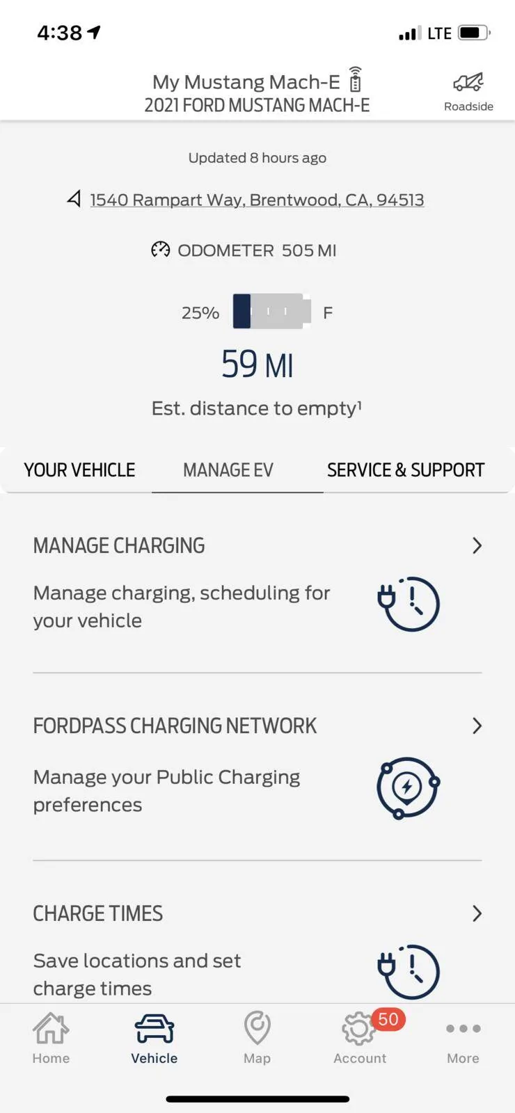
Simplify simplify simplify. The initial home screen is a good start, all the important info quickly available on one screen. I'd recommend getting rid of the "tiles" at the bottom (finding a dealer isn't really a home screen need, and the remote vehicle setup should go away).
Vehicle tab is okay, could be cleaned up but it's okay.
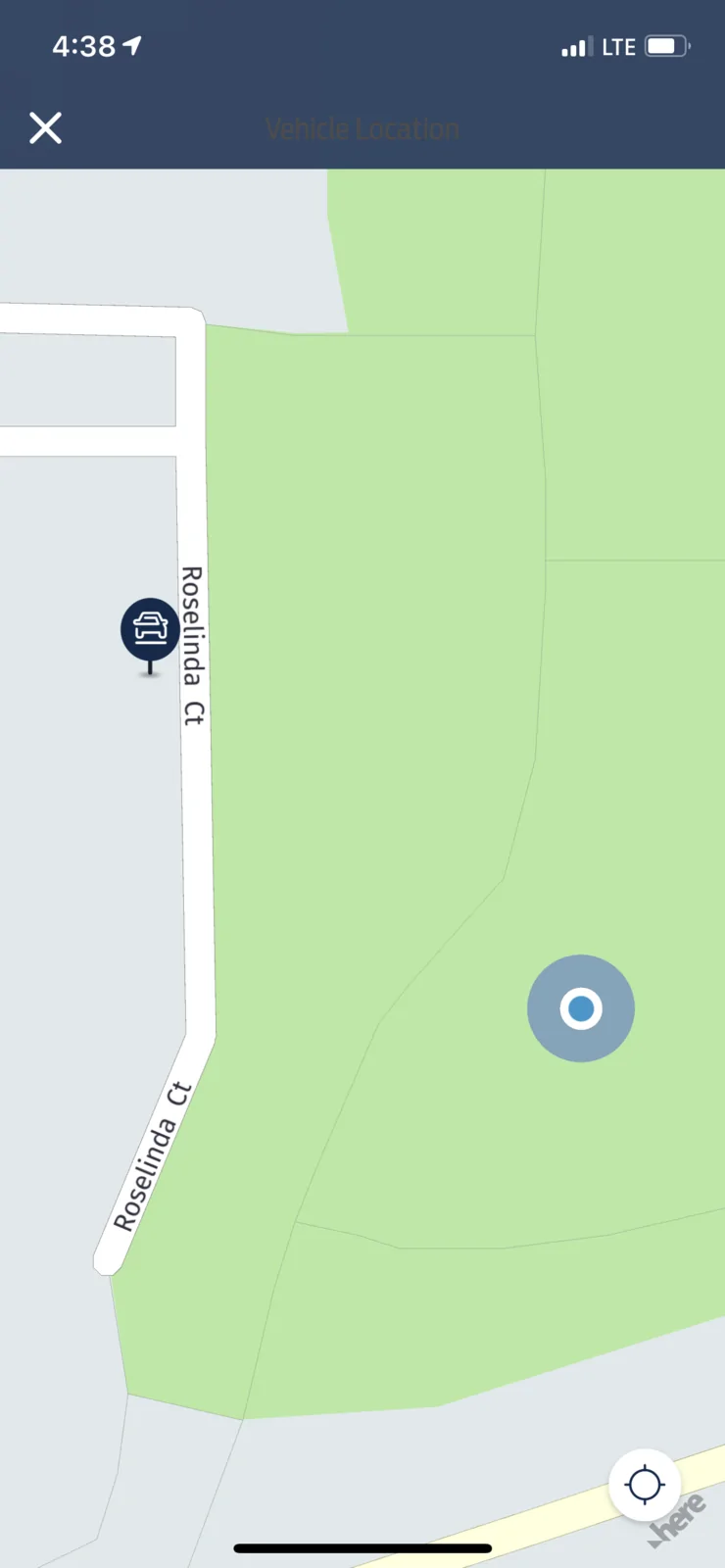
The map.. this is where I think it needs the most work. The use is not intuitive, there are better map programs out there, use one as a guide. Specifically, if I check out an address, then look for charging near by it zooms me out with no why of seeing the relation to the spot I was looking into. An example of how this is done well would be the zillow app.
General feedback, get rid of the delay when selecting between tabs.
Vehicle tab is okay, could be cleaned up but it's okay.
The map.. this is where I think it needs the most work. The use is not intuitive, there are better map programs out there, use one as a guide. Specifically, if I check out an address, then look for charging near by it zooms me out with no why of seeing the relation to the spot I was looking into. An example of how this is done well would be the zillow app.
General feedback, get rid of the delay when selecting between tabs.
Sponsored