Sync 4A Update Overview from Ford - Larger Apple CarPlay Android Auto interface, added dial functionality & more
generaltso
Well-Known Member
- Joined
- Jun 24, 2020
- Threads
- 76
- Messages
- 15,389
- Reaction score
- 28,694
- Location
- Vermont
- Vehicles
- 2024 Kia EV9 GT-Line
When did you get so optimistic?I’m pretty optimistic that this “soon” means Dec ‘22, at least for the folks in EA.

jmatero
Well-Known Member
- First Name
- John
- Joined
- Jul 21, 2022
- Threads
- 20
- Messages
- 256
- Reaction score
- 248
- Location
- San Jose, CA
- Vehicles
- 2022 MME GT-P
Appreciate some of the updates they mention because they seem like they could be very helpful. However, using the dial knob for temperature control and heated seats adds another level of complexity to something that should be straightforward. My Teslas had the temperature with an up and down button, just like the Mach-e but all I had to do was tap the up or down button. One interaction, instant result, same with the heated seats. I tapped it once for high again for medium again for low again for off, simple. On the Mach-e,, it looks like you have to tap the temperature control and then twist a dial or tap the heated seat button and then twist a dial. It doesn’t simplify the current process, it just creates eye candy. Especially with those functions at the bottom of the screen requiring you to look off the road. They really need some expert UI folks. My experience giving feedback in focus groups on UI design always had me testing new features in a stopped car with no distractions.
Volfan615
Active Member
- Joined
- May 19, 2022
- Threads
- 5
- Messages
- 43
- Reaction score
- 26
- Location
- TN
- Vehicles
- 2022 Cyber Orange GT Performance
I actually think that using the dial makes a lot of sense. Touch screen buttons can be difficult to use when driving. Requiring you to look away and try to operate the touch screen while driving. I don't think it's eye candy at all. I think it's very smart of Ford to do this.Appreciate some of the updates they mention because they seem like they could be very helpful. However, using the dial knob for temperature control and heated seats adds another level of complexity to something that should be straightforward. My Teslas had the temperature with an up and down button, just like the Mach-e but all I had to do was tap the up or down button. One interaction, instant result, same with the heated seats. I tapped it once for high again for medium again for low again for off, simple. On the Mach-e,, it looks like you have to tap the temperature control and then twist a dial or tap the heated seat button and then twist a dial. It doesn’t simplify the current process, it just creates eye candy. Especially with those functions at the bottom of the screen requiring you to look off the road. They really need some expert UI folks. My experience giving feedback in focus groups on UI design always had me testing new features in a stopped car with no distractions.
Keeperofthe7keys
Well-Known Member
- Joined
- Sep 30, 2021
- Threads
- 1
- Messages
- 238
- Reaction score
- 200
- Location
- Pennsylvania
- Vehicles
- 2022 Mustang Mach e Premium
I agree about the heated seats should just be tap through 3 levels and off, but for temperature and fan speed the dial is a huge improvement over the touchscreen sliders which are probably the ultimate UI design crime. Obviously we should actually have real buttons but this is the best improvement they could do with existing hardware.Appreciate some of the updates they mention because they seem like they could be very helpful. However, using the dial knob for temperature control and heated seats adds another level of complexity to something that should be straightforward. My Teslas had the temperature with an up and down button, just like the Mach-e but all I had to do was tap the up or down button. One interaction, instant result, same with the heated seats. I tapped it once for high again for medium again for low again for off, simple. On the Mach-e,, it looks like you have to tap the temperature control and then twist a dial or tap the heated seat button and then twist a dial. It doesn’t simplify the current process, it just creates eye candy. Especially with those functions at the bottom of the screen requiring you to look off the road. They really need some expert UI folks. My experience giving feedback in focus groups on UI design always had me testing new features in a stopped car with no distractions.
Gullwingdmc
Well-Known Member
- First Name
- Chip
- Joined
- May 15, 2021
- Threads
- 85
- Messages
- 2,943
- Reaction score
- 4,110
- Location
- Boston, MA
- Vehicles
- 2022 Mustang Mach E GT AWD ER - Grabber Blue
“Bad Ergonomics” is the mission statement for Ford’s UI team lately.Bad ergonomics.
johnmark
Well-Known Member
- First Name
- JM
- Joined
- Jun 22, 2022
- Threads
- 14
- Messages
- 364
- Reaction score
- 373
- Location
- Massachusetts
- Vehicles
- '22 Mustang Mach-E GT
Agreed. Turning a physical knob requires less looking away from the road. Whereas now I have to look away to tap the soft button for temp and then keep looking to see where to tap to increase or decrease. Whereas if I only need to tap once and then turn the knob, I can keep my eyes on the road for the most part. Although I'll still need to glance at the temp to make sure it's correct.I actually think that using the dial makes a lot of sense. Touch screen buttons can be difficult to use when driving. Requiring you to look away and try to operate the touch screen while driving. I don't think it's eye candy at all. I think it's very smart of Ford to do this.
What would be super cool is if the dash display could show the temp setting while I'm turning the knob. That would require no additional glancing away from the road.
- Joined
- Oct 8, 2020
- Threads
- 111
- Messages
- 3,754
- Reaction score
- 6,166
- Location
- Kansas
- Vehicles
- "Sonic" 2021 MME Grabber Blue First Edition
- Banned
- #233
I think tapping once and twisting a physical knob sounds a LOT easier than repeatedly stabbing away at an electronic plus / minus on a screen while driving, but I dunno. Guess we'll see. Remember, the plus / minus is at the bottom of the screen, too.Appreciate some of the updates they mention because they seem like they could be very helpful. However, using the dial knob for temperature control and heated seats adds another level of complexity to something that should be straightforward. My Teslas had the temperature with an up and down button, just like the Mach-e but all I had to do was tap the up or down button. One interaction, instant result, same with the heated seats. I tapped it once for high again for medium again for low again for off, simple. On the Mach-e,, it looks like you have to tap the temperature control and then twist a dial or tap the heated seat button and then twist a dial. It doesn’t simplify the current process, it just creates eye candy. Especially with those functions at the bottom of the screen requiring you to look off the road.
Agree.They really need some expert UI folks. My experience giving feedback in focus groups on UI design always had me testing new features in a stopped car with no distractions.
Keeperofthe7keys
Well-Known Member
- Joined
- Sep 30, 2021
- Threads
- 1
- Messages
- 238
- Reaction score
- 200
- Location
- Pennsylvania
- Vehicles
- 2022 Mustang Mach e Premium
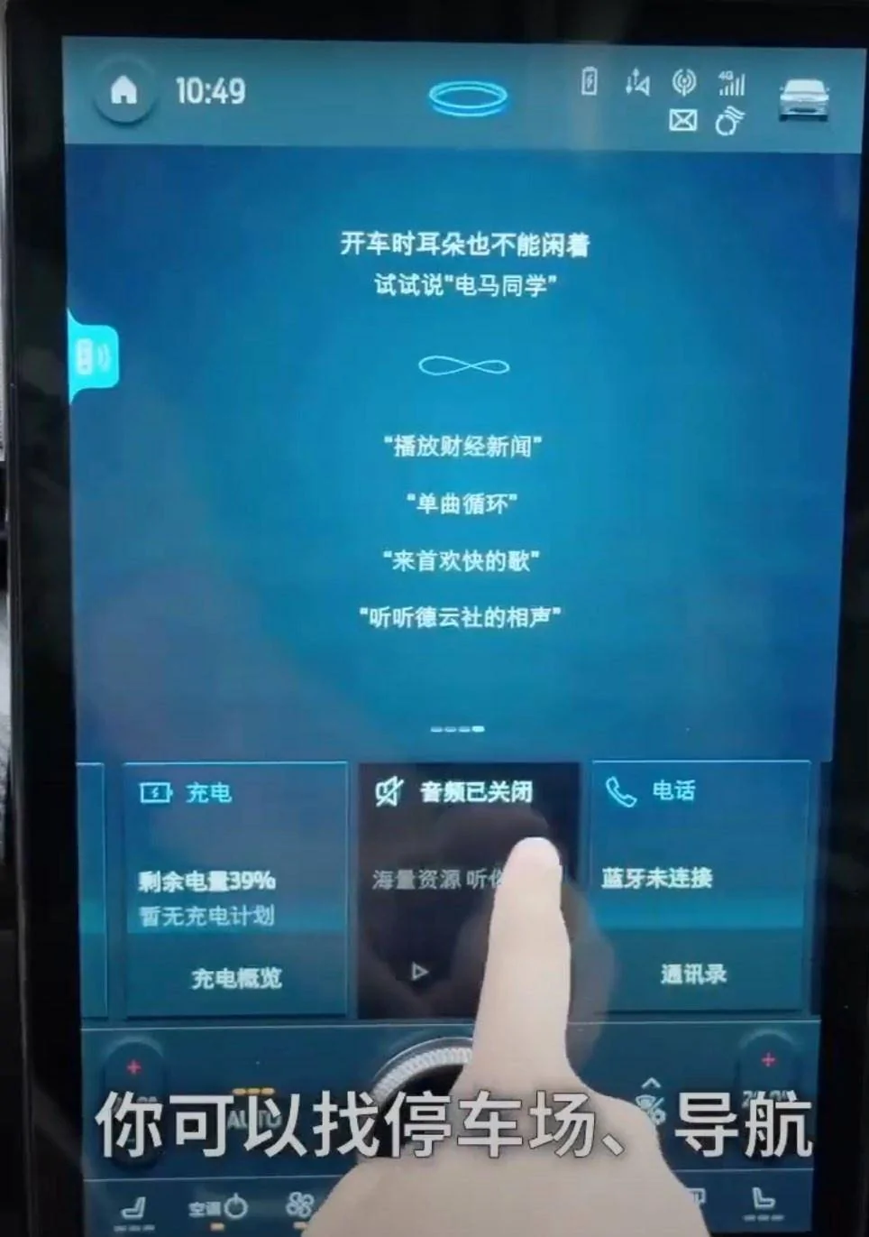
@Gullwingdmc Since you were complaining about the home and settings buttons being gray and not matching the background, check out the Chinese UI on a 23MY car

awp0
Well-Known Member
- First Name
- Aaron
- Joined
- Jul 23, 2022
- Threads
- 13
- Messages
- 973
- Reaction score
- 1,216
- Location
- boston, ma
- Vehicles
- MME Premium AWD ER
Hold on. Do you guys know that you won't have those options (button presses instead of knob)? The "+/-" soft buttons are still in the screenshot so you can probably still use them for temp control if you prefer. And I wouldn't be surprised if the heated seats button is redesigned to cycle through the heated seat options by pressing it. I say this because not only is the current "slider" for heated seats universally hated, but it would also be pretty awkward to have both the slider and the knob activated at the same time when you press the heated seats button. Admittedly it's speculation on my part.
My biggest concern is whether I should turn off automatic updates until we get more feedback on this update. I'd like to get these UI improvements, but I have no idea what price we'll pay in terms of bugs and regressions. I really wish I could uninstall the Youtube update and have reliable profiles and Carplay again.
My biggest concern is whether I should turn off automatic updates until we get more feedback on this update. I'd like to get these UI improvements, but I have no idea what price we'll pay in terms of bugs and regressions. I really wish I could uninstall the Youtube update and have reliable profiles and Carplay again.
Gullwingdmc
Well-Known Member
- First Name
- Chip
- Joined
- May 15, 2021
- Threads
- 85
- Messages
- 2,943
- Reaction score
- 4,110
- Location
- Boston, MA
- Vehicles
- 2022 Mustang Mach E GT AWD ER - Grabber Blue
The color of the home button definitely looks better there. Not sure what’s happening in the center or right side.@Gullwingdmc Since you were complaining about the home and settings buttons being gray and not matching the background, check out the Chinese UI on a 23MY car
Keeperofthe7keys
Well-Known Member
- Joined
- Sep 30, 2021
- Threads
- 1
- Messages
- 238
- Reaction score
- 200
- Location
- Pennsylvania
- Vehicles
- 2022 Mustang Mach e Premium
No idea, the Chinese seem to get a different version than us, pulled this out of a youtube video in another thread.The color of the home button definitely looks better there. Not sure what’s happening in the center or right side.
Gullwingdmc
Well-Known Member
- First Name
- Chip
- Joined
- May 15, 2021
- Threads
- 85
- Messages
- 2,943
- Reaction score
- 4,110
- Location
- Boston, MA
- Vehicles
- 2022 Mustang Mach E GT AWD ER - Grabber Blue
I’ll be interested to see how the new UI performs in the US version. Hopefully it’s smoother as a trade off for the ugly.No idea, the Chinese seem to get a different version than us, pulled this out of a youtube video in another thread.
TTF
Well-Known Member
- Joined
- Sep 5, 2022
- Threads
- 2
- Messages
- 67
- Reaction score
- 58
- Location
- Niagara Ontario
- Vehicles
- 2022 Mach E Premium E4x
Does anyone actually use Alexa? I would love to see some usage statistics on that.
No, No No, delete is now!
npgeorgeuw
Well-Known Member
- First Name
- Nicholas
- Joined
- Feb 5, 2022
- Threads
- 5
- Messages
- 161
- Reaction score
- 173
- Location
- Issaquah, WA
- Vehicles
- Mach E GT PE, Jeep Gladiator "Willys"
- Occupation
- Business Owner
Owning both the EV6 and a Mach E I can say that adjusting anything on the EV6 is far easier (less distraction and looking away from the driving) precisely because of that toggling of HVAC and media controls on the capacitive panel. I find it funny that it’s “unanimously” criticized but it does require one singular mental memory to adjust to and that is new to people. You only look at one singular point on the panel and then know if it’s hvac or media controls. Also keep in mind when you toggle it all the “buttons” change so you can see that too. It’s painfully easy and a smart solution that doesn’t clutter my beautiful screen with crappy physical or virtual buttons that aren’t needed.I'll add that the problem with double-stacking unrelated functions onto physical knobs where you have to look at them to understand what mode they're in can also be seen in the KIA EV6. It's been unanimously crticized for its toggling controls that change the function of the touch/knob area under the screen from HVAC to audio controls.
This whole thing from Ford feels like it could be a similar confusing situation for many drivers.
Sponsored
Similar threads
- Replies
- 36
- Views
- 18,764
- Replies
- 9
- Views
- 10,146