zhackwyatt
Well-Known Member
- Joined
- Dec 18, 2019
- Threads
- 14
- Messages
- 1,617
- Reaction score
- 2,635
- Location
- Arizona
- Vehicles
- '21 InfBlu Prem MMEx, '21 F150 PowerBoost Hybrid Past: '13 C-Max '98 Explorer
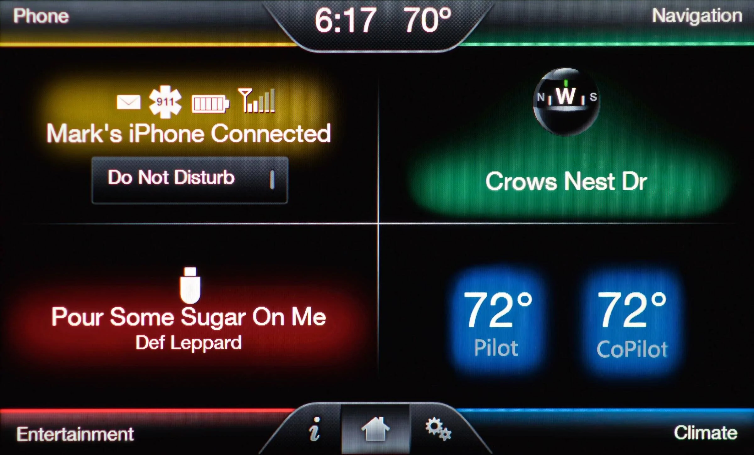
I always enjoyed the colored quadrant design, matching the colors in the instrument cluster. You could show what you wanted where you wanted it.Huh? MyFordTouch (Sync 2-ish?) was fantastic, except for the extreme sluggishness, crashes require fuse resets, slow USB updates, smaller set of capabilities, lack of Android Auto, and the sunsetted dial up modem bank. Other than that it was fine. ?
Sponsored