OP
OP
bbachrac
Well-Known Member
- First Name
- Robert
- Joined
- Jan 1, 2022
- Threads
- 16
- Messages
- 83
- Reaction score
- 85
- Location
- Califronia
- Vehicles
- Ford Mach-E Premium Nite Pony 2023
- Occupation
- NA
- Thread starter
- #31
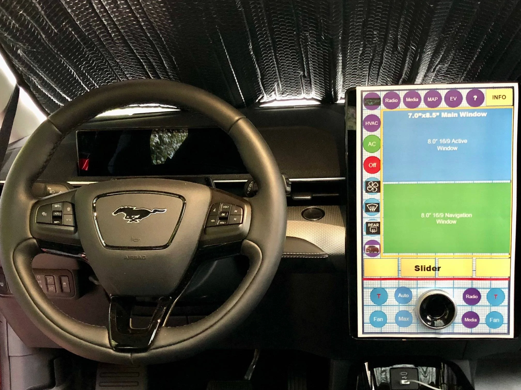
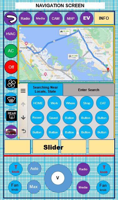
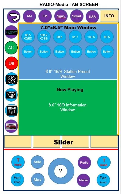
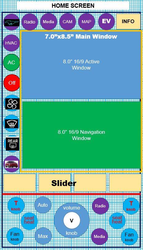
The coloring was not meant to be an artistic theme and was just for distinct labeling. Any graphics was just suggestive and the grid showing through was just for sizing the mock up which I did in powerpoint.The graphics / colors are worse, but IMHO, the layout he suggested with the big buttons and most controls easier to find with less clicks looks a lot better than what we have now. The biggest thing I see lacking on the current and mock-up is the camera button. That should always be one button, not hidden behind another icon.
I have never used the camera button, but now see where it is.
Today I changed the charging percentage from 85 to 80%. It took 6 button clicks to get there.
I also just looked up IMHO - in my humble opinion.... Thanks for comments.
Sponsored