Infotainment Redesign Coming -- via updated software or hardware?
Jimrpa
Well-Known Member
- First Name
- Jim
- Joined
- Sep 10, 2020
- Threads
- 297
- Messages
- 9,573
- Reaction score
- 12,900
- Location
- Wayne, PA
- Vehicles
- 2021 Infinite Blue Premium Mustang Mach E ER AWD
- Occupation
- Retied (formerly tried to herd highly technical, independent cats)
It’s not easy to tell with the white circle and truck icon.that is what the lower image is...
OP
OP
jmatero
Well-Known Member
- First Name
- John
- Joined
- Jul 21, 2022
- Threads
- 20
- Messages
- 256
- Reaction score
- 248
- Location
- San Jose, CA
- Vehicles
- 2022 MME GT-P
- Thread starter
- #123
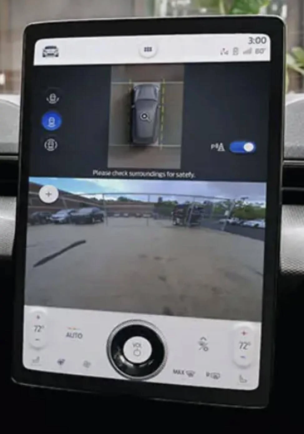
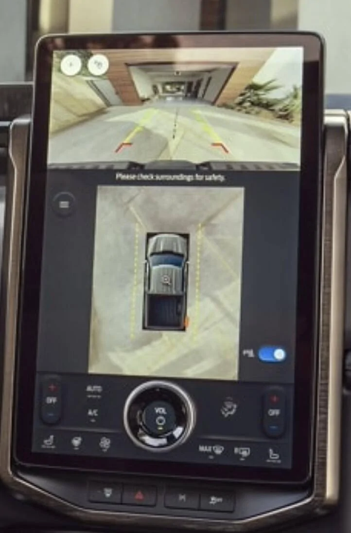
Yes it does... and it's much larger and on the bottom half of the screen with front/rear cam up top in line of sight. Also looks like they gained more room by nixing the menu bar when the cam is on. Pretty certain this will move to the MME via update.So the F150 Lightning doesn’t get a “birds-eye” view like we do?
MME:
Lightning:
Last edited:
Kamuelaflyer
Well-Known Member
- First Name
- Bill
- Joined
- Feb 18, 2020
- Threads
- 11
- Messages
- 11,389
- Reaction score
- 23,040
- Location
- Hawaii
- Vehicles
- 2021 Premium Infinite Blue. ER AWD. 2020 Raptor, 2021 Ranger.
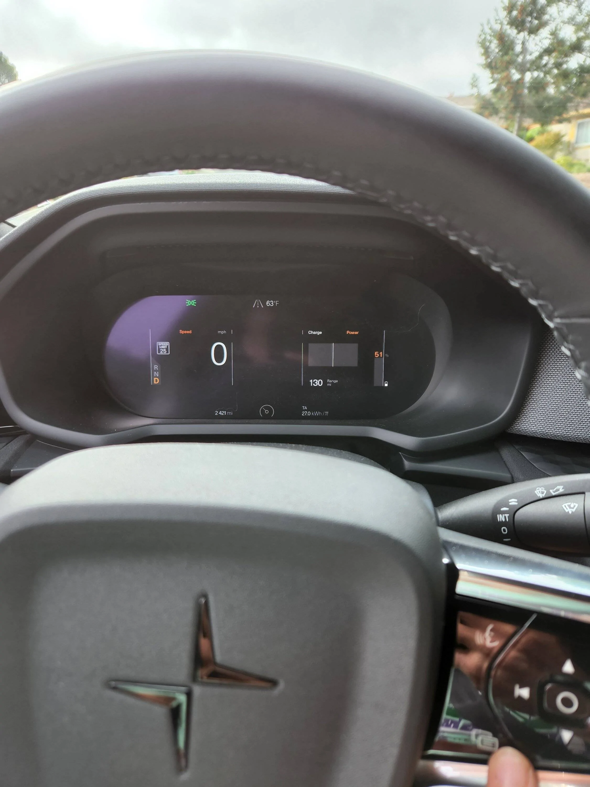
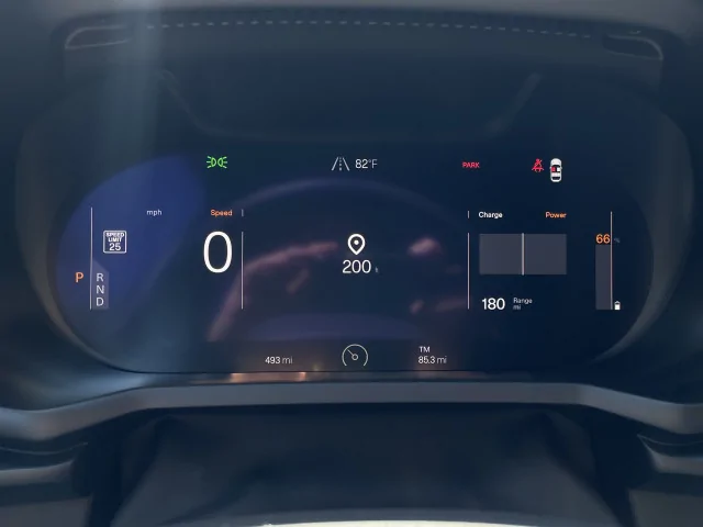
Still not quite right. Needs the next turn (if you're using navigation) and the distance to that turn.For those who want a basic screen with a simple click of a button you get this.

Jimrpa
Well-Known Member
- First Name
- Jim
- Joined
- Sep 10, 2020
- Threads
- 297
- Messages
- 9,573
- Reaction score
- 12,900
- Location
- Wayne, PA
- Vehicles
- 2021 Infinite Blue Premium Mustang Mach E ER AWD
- Occupation
- Retied (formerly tried to herd highly technical, independent cats)
Cool! That’s much better. I like that!Yes it does... and it's much larger and on the bottom half of the screen with front/rear cam up top in line of sight. Also looks like they gained more room by nixing the menu bar when the cam is on. Pretty certain this will move to the MME via update.
MME:


OnceYouGo
Well-Known Member
- First Name
- Scott
- Joined
- Jul 7, 2021
- Threads
- 2
- Messages
- 64
- Reaction score
- 60
- Location
- San Francisco
- Vehicles
- 2021 Mach-E Premium RWD, Job 1
The polestar does, it pops in the center. I wasn't running any directions so no turns to show.Still not quite right. Needs the next turn (if you're using navigation) and the distance to that turn.
Kind of like what's pictured, except the image is of reaching the destination. Replace it with arrows just like the MME.
RickMachE
Well-Known Member
- Joined
- Jul 1, 2021
- Threads
- 267
- Messages
- 17,961
- Reaction score
- 28,002
- Location
- SE MI
- Vehicles
- 2022 Mach-E Premium 4X, 2022 Lightning Lariat ER
I'm currently driving my dealership's F-150L demo. Unfortunately, it's an XLT, not a Lariat, so it has the built-in horizontal screen not the vertical screen. Horizontal is horrible, the keyboard covers the destination prompts when using navigation. Reaction is slow, and I also found that AC, while driving in 80 degree weather, was ineffective unless I put it into Max AC mode. And no sun was on the vehicle.
Nice ride though, much less bouncy than the Mach-E. Acceleration was very fast. I did notice that at 75 I don't feel like I'm going 75. Took it up over 100 and even that doesn't feel it. Much more noticeable in the Mach-E.
No idea when I will be able to order mine, if I choose to. Today I will try and fit it in the garage to verify, then some final driving before returning it and picking up our recall-updated 2022 Mach-E.
VegStang
Well-Known Member
- First Name
- Leo
- Joined
- Jan 30, 2020
- Threads
- 5
- Messages
- 1,268
- Reaction score
- 1,367
- Location
- Silicon Valley
- Vehicles
- Volvo C40 Recharge, 2023 MME
- Occupation
- Artist, animal rights activist
Sounds about correct since Polestar is owned by a company based in China, and the car is built in a factory in China.
What is the Chinese parts content on the Polestar? I've heard 99%, but I (oddly) can't find an image of a Polestar monroney anywhere.
AllenXS
Well-Known Member
- First Name
- Allen
- Joined
- Jan 11, 2021
- Threads
- 13
- Messages
- 1,339
- Reaction score
- 1,706
- Location
- Richmond, BC, Canada
- Vehicles
- Premium Blue ER AWD
Questionable friggin truth?Well it could be an abbreviation for Quantum Field Theory. But it’s pretty safe to assume that all I know about that is that there is such a thing.
In this case though …

mdolan92869
Well-Known Member
- First Name
- Mike
- Joined
- Feb 25, 2021
- Threads
- 25
- Messages
- 1,149
- Reaction score
- 2,606
- Location
- Orange County, CA
- Vehicles
- '21 Mach-e (Had '83 GT, '89 GT Ragtop, '13 GT)
- Occupation
- Retired Software Engineer
Could it mean Queso Free Taco, for the lactose intolerant?Questionable friggin truth?
devmach-e
Well-Known Member
- First Name
- David
- Joined
- Sep 8, 2021
- Threads
- 1
- Messages
- 2,030
- Reaction score
- 2,488
- Location
- SF Bay Area
- Vehicles
- 2022 Premium RWD ER, 2016 Toyota Highlander Hybrid
- Occupation
- Unix Sysadmin
Questionable Frunk TamalesCould it mean Queso Free Taco, for the lactose intolerant?
Addos
Well-Known Member
- First Name
- Bradley
- Joined
- Mar 15, 2021
- Threads
- 3
- Messages
- 133
- Reaction score
- 140
- Location
- Raleigh, NC
- Vehicles
- 2021 Grabber Blue First Edition Mustang Mach E AWD
I think Ford needs to remove the radio buttons, and make everything slider toggles for on/off true/false. Can't stand that the current UI mixes them up.I think the biggest issue I had with the original design was crowding the top of the screen with lots of buttons. It might have looked something like this...

Currently playing is also one of the things added to sync, not the IPC however. There should also be a persistent app bar, sticky navigation to the top etc.

Addos
Well-Known Member
- First Name
- Bradley
- Joined
- Mar 15, 2021
- Threads
- 3
- Messages
- 133
- Reaction score
- 140
- Location
- Raleigh, NC
- Vehicles
- 2021 Grabber Blue First Edition Mustang Mach E AWD
There is already a physical button for max defrost. Why does there need to be a software display button for it too?My guess would be that the main screen is dedicated towards items that are easily accessible while operating the vehicle. The NHTSA has strict guidelines about how long someone can be looking at anything other than the road while the vehicle is in motion. Vehicle UI Designs have to take this into consideration.
Max defrost, while maybe you and I won't need to use it often, other's might and not being able to see out of a frosted window, would be dangerous. So, it's something that's available on the home screen for good reason. Opening a trunk/frunk is not something that needs to be done while in motion or while attention should be dedicated to the road, therefore it's put in a secondary menu. While this can be a PITA, it's prioritizing things for safety reasons.
I believe, as Hunting posted above, that it should be a physical button only accessible to the driver. I think Ford missed the mark on that one. There are threads on how to add that button, but we will also be getting a TSB to replace it at some point for that entire headlight control unit so I probably wouldn't mess with it until after.
DevSecOps
Well-Known Member
- First Name
- Todd
- Joined
- Sep 22, 2021
- Threads
- 69
- Messages
- 4,764
- Reaction score
- 11,624
- Location
- Sacramento, CA
- Vehicles
- '21 Audi SQ5 / '23 Rivian R1T / '23 M3P
- Occupation
- CISO
Not all the MMEs have a physical max defrost.There is already a physical button for max defrost. Why does there need to be a software display button for it too?
AllenXS
Well-Known Member
- First Name
- Allen
- Joined
- Jan 11, 2021
- Threads
- 13
- Messages
- 1,339
- Reaction score
- 1,706
- Location
- Richmond, BC, Canada
- Vehicles
- Premium Blue ER AWD
As soon as I repeat it like this, it is now taken as factCould it mean Queso Free Taco, for the lactose intolerant?
Sponsored

